Assignment 1: Contrast

For this assignment I have chosen photographs that sometimes show the contrast subject individually and other times by comparing pairs. I'll describe briefly for each image why I chose it for its contrast meaning.
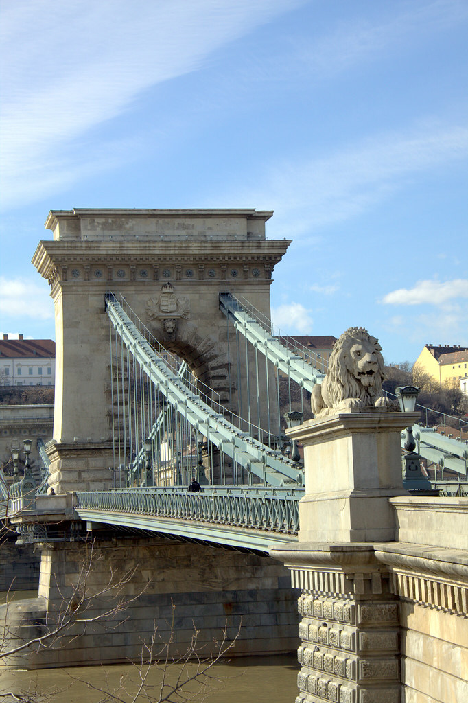
Light/Dark

light


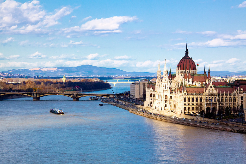
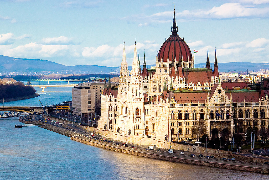
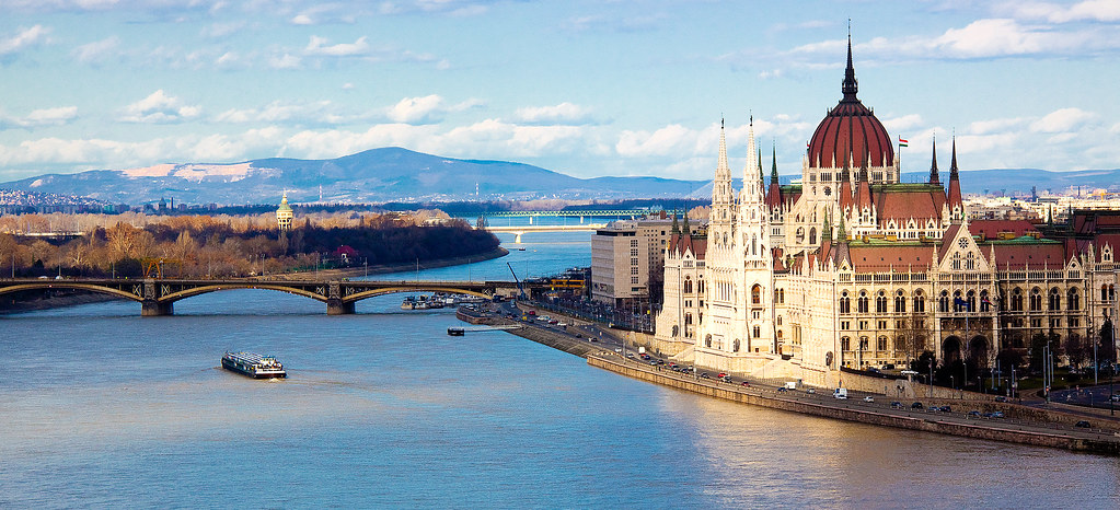
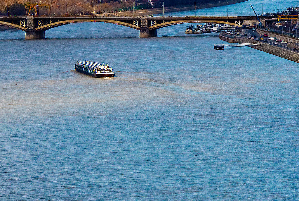
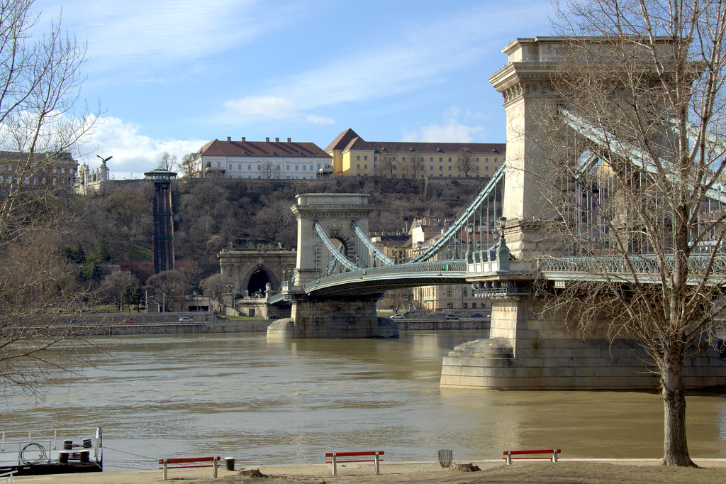
This is a picture I have taken while in Budapest. Many parts of this city are not well lit at night, apart from the touristic or shopping area. Light is what makes this landscape come alive. The light on the Buda castle, light trails by cars on the road, light on the bridge at the back. This was shot handheld (with support from a fence) with an 8 second exposure to make this picture come alive.

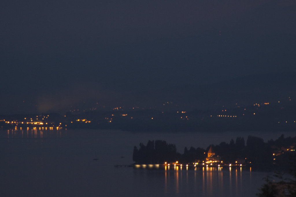
Dark


This was shot from a hill in Lausanne late at night. Even with a 30 seconds exposure the landscape is very dark. However, it is still possible to view the landscape through its darkness. Comapred to the image above in budapest this one comes out as dark. 


High/Low


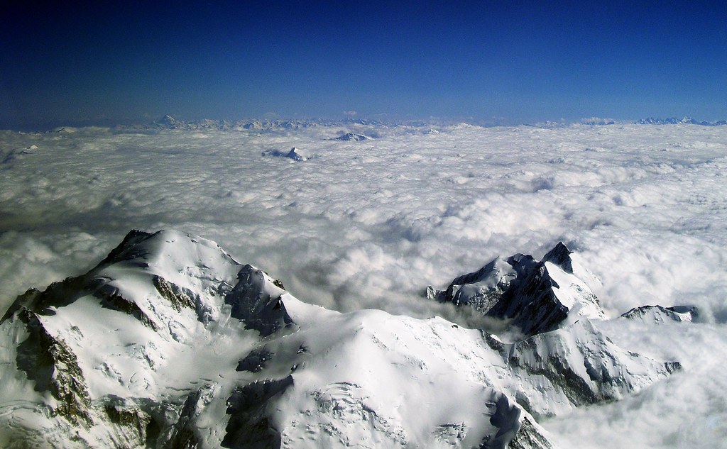
High


The mountains being the highest point human beings can imagine reaching with no flying objects, being above the clouds, having shot this from a plane this really does the trick at meaning High.

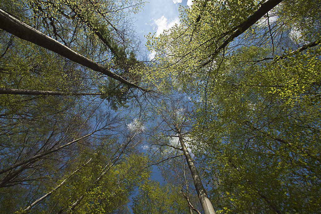
Low


On a walk in the forrest I was amazed how high were the trees surrounding me and how small I felt looking at the sky. I tried to increase the effect by using a wide angle lens at a focal lenght of 10mm.


Moving/Still

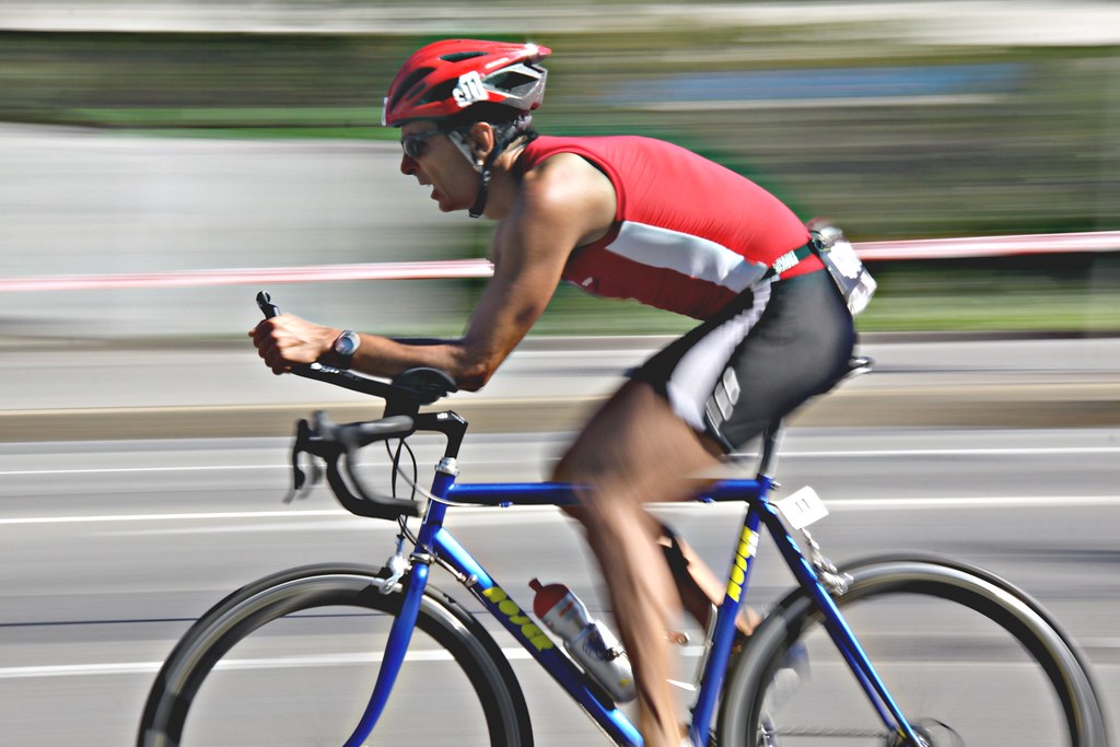
Moving


This was taken at the triathlon event in Lausanne. Using the panning technique at 1/25 second made the background blurr while keeping most part of the upper body of the racer sharp. 


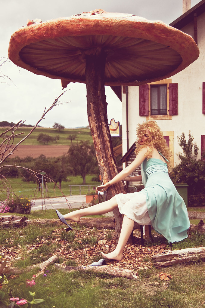
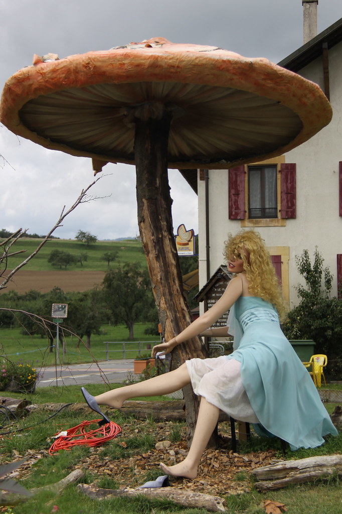
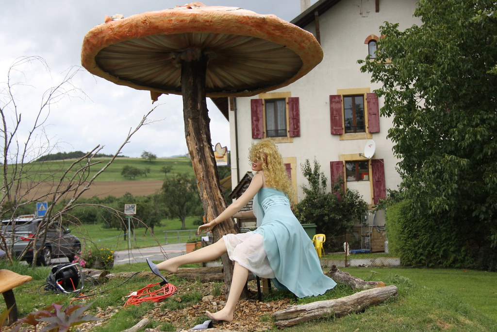
Still


While driving to the country side I found this very original setting of a human like doll posing under a giant mushroom. At first glance it wasn't obvious whether it was human or not. My aim in this picture was not to make it obvious right away why it is linked to the subject "still". I think this pictures works well in keeping a part of mystery. I have cloned out a few objects in this picture that were not adding anything to the scene. the original can be seen in the vertical/horizontal exercise.


Diagonal/Rounded

These two pictures were taken in Valencia, Spain, at the city of Arts and Sciences. These buildings were design by Valencian  architect Santiago Calatrava. The design of the city is amazing, all the buildings are unusual to the eye and undeniably attractive. It uses the reflection of the sun as part of it design and at night, the reflection in the pool surrounding the city makes the whole set look like a giant fish.
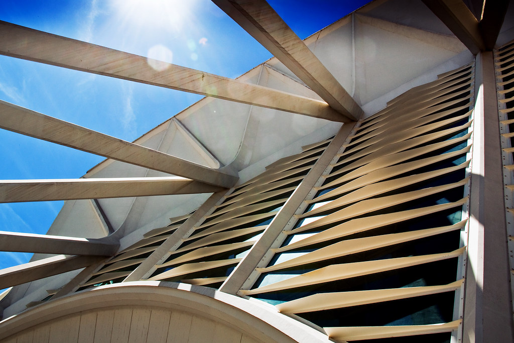

Diagonal


When I saw this it screamed diagonal to me. I decided to keep the sun flare in this picture as the sun is to me a major player in modifying how  the whole building looks like.


Rounded


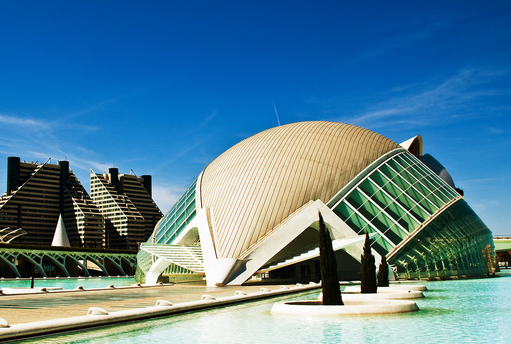
The round shape of this building is so unusual that rounded is what first comes to mind.


Smooth/Rough

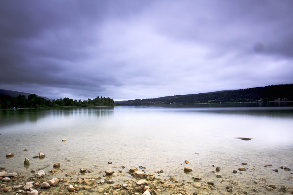
Smooth


I chose this picture for its smooth appeal. When taking the picture I used an ND400 Hoya filter of 9 stops which acts like sunglasses for taking long exposures. A 30 seconds exposure smoothed out the lake of the Vallée de Joux and gives a very peaceful effect to the image. The movement of the clouds in the sky were smoothed out through the same process.


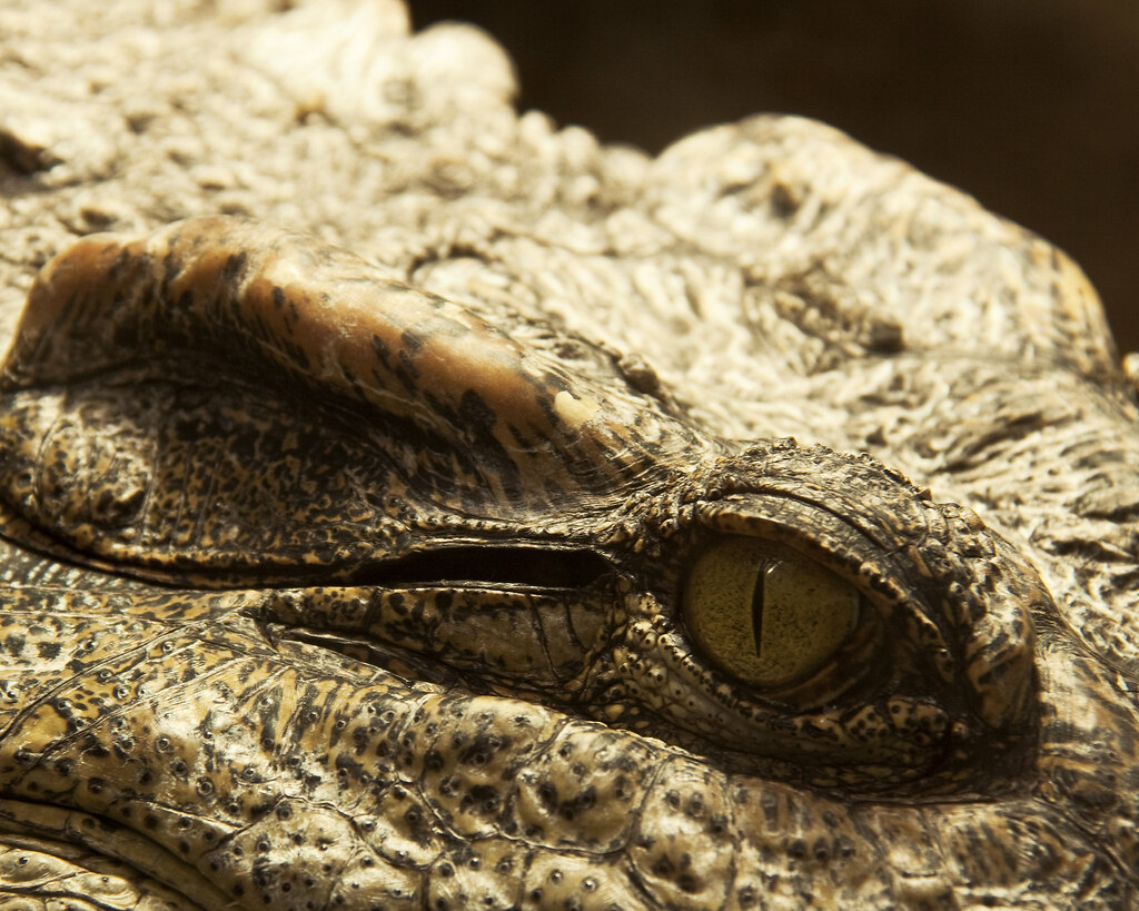
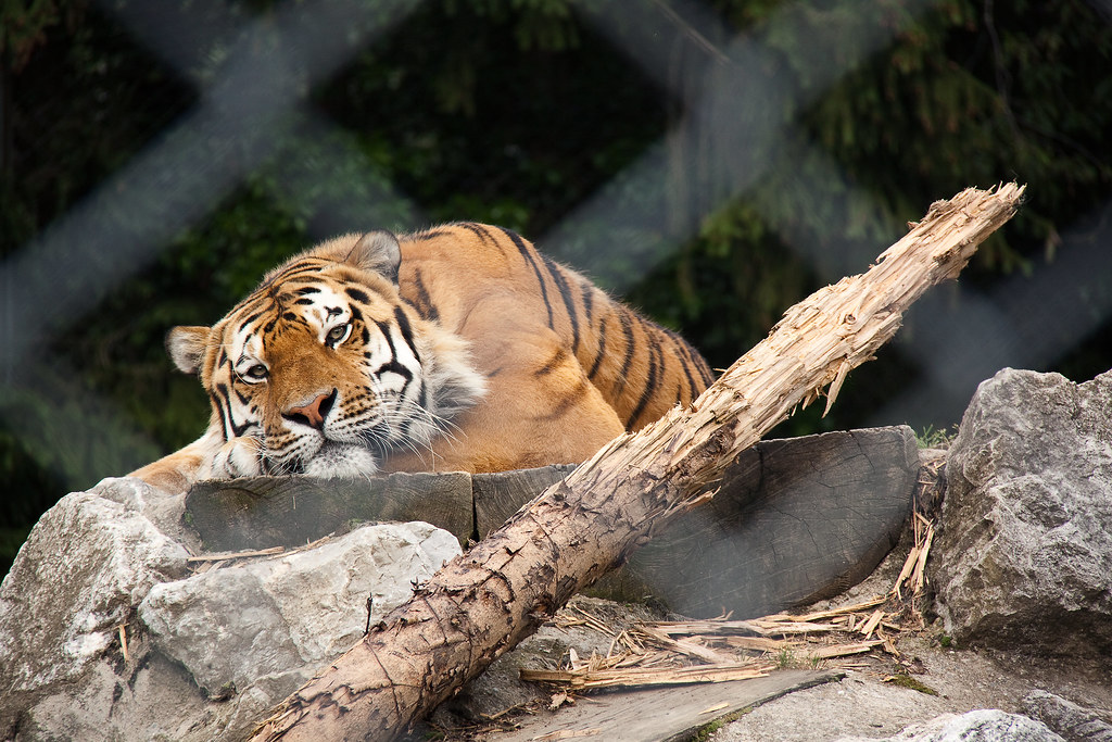
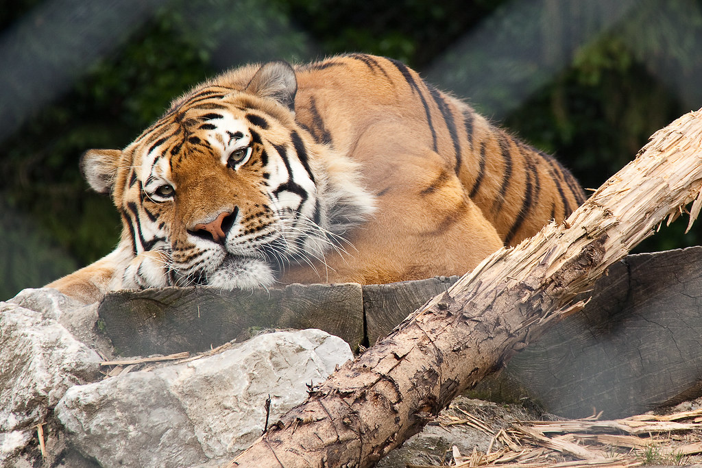
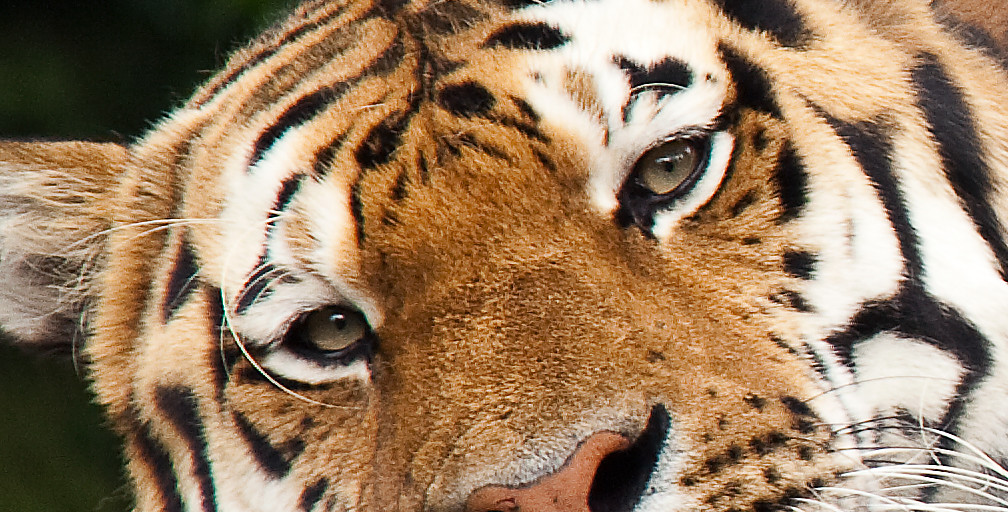
Rough


Although it doesn't work quite well as a pair with the "smooth" image I think it does when thinking of rough. Everything is rough in a crocodile, his skin, his look, its colours, the way it moves, attacks and eats. This was shot at the zoo of Servion, outside of Lausanne.
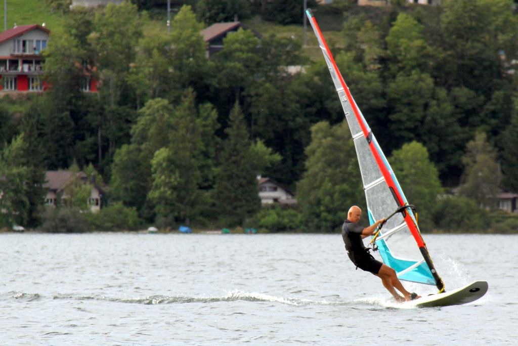
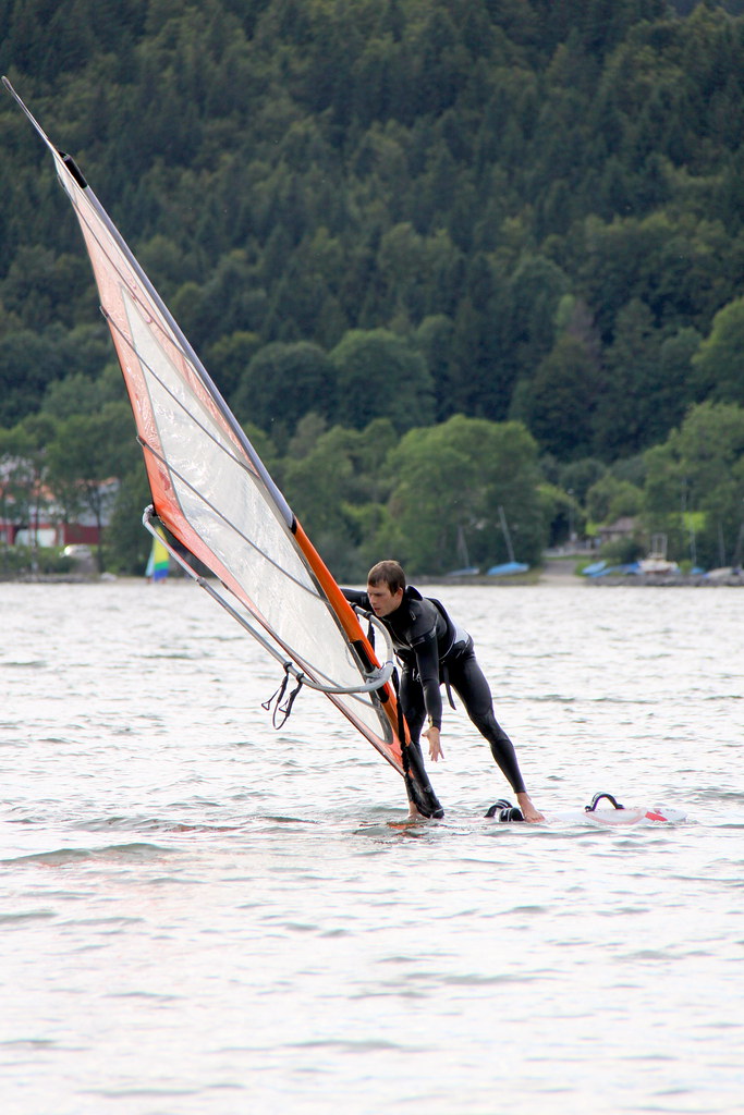


Heavy/Light

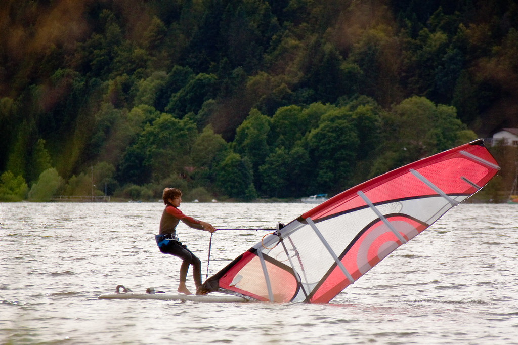
Heavy


Heavy is what came to mind when I saw this kid struggling to lift his sail. It reminded me of my first attempt at windsurfing and it is indeed quite heavy when you haven't yet mastered the technique.

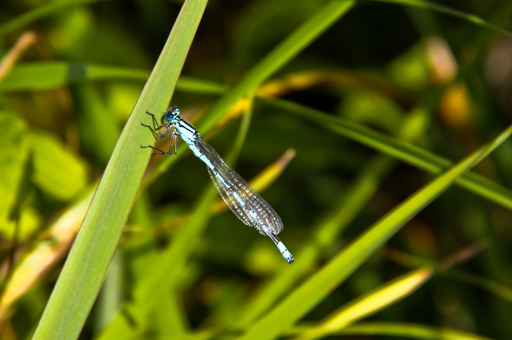
Light


I thought of light when I first caught sight of something blue flying around bushes. When I got closer I saw this beautiful tiny insect, which looks like a dragonfly, hanging on a leave. I had to zoom in at a focal length of 190 mm and used manual focus as my lens could not focus properly on such a small subject. The picture was then cropped to get a closer look.


Thin/Thick


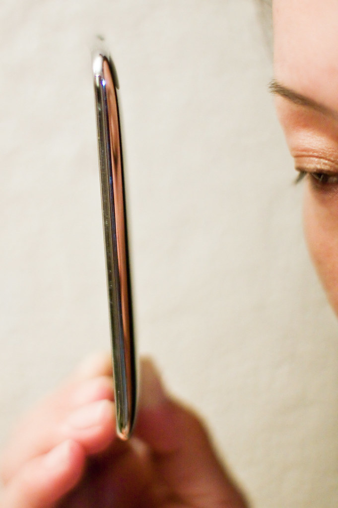
Thin


Although I'm not a smart phone addict (it will probably take me another 10 years before getting one) it is undeniably thin. How much can be stored in such a small container amazes me. 


thick


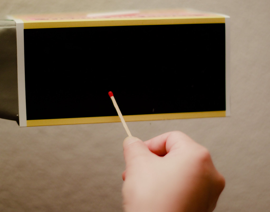
I thought this would make a nice pair with the previous picture. An oversized match boxed has been used to emphasize the thickness of it.


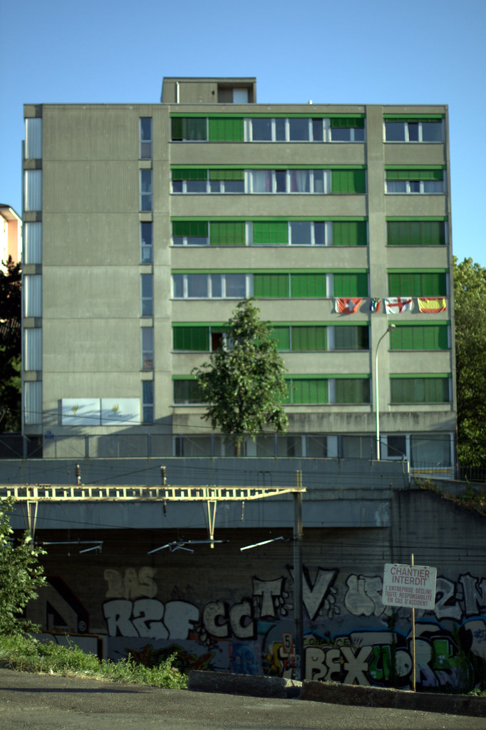
Continuous/Intermittent


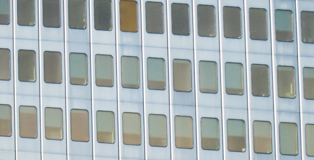
Continous


For this shot I thought this continuous row of windows on a building built in the 60's would cover this theme well. I deliberately cropped it in a non symmetric or linear way. I think this way it gives less information on how big the building is and whether or not it is a building.


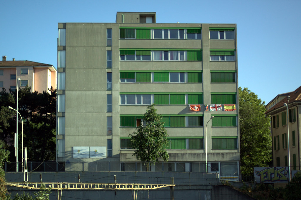
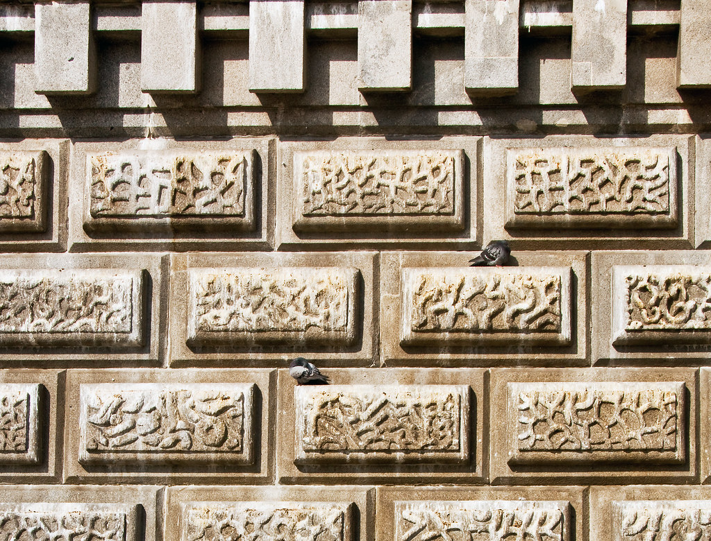
Intermittent


This could have been continuous but the presence of the pigeons makes it intermittent to me. I have also left the top of the frame to make it look less continous.


White/Black


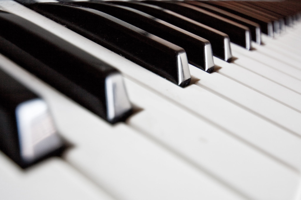
I have decided a picture of my electronic piano would be perfect to have a pair of contrast in one. We always associate a piano or a keyboard with white and black keys. I ahve used a wide angle to give it a fresh look and composed it with a diagonal direction across the frame from the bottom left to the top right.


Color Space and Profiles.

I have noticed a big difference on the images I have uploaded to the web and the ones I view on photoshop. Furthermore, the pictures are not displayed the same when using Firefox or Internet explorer. I believe there would be differences with other browsers too.
Of course, if on top of that the screen you're using hasn't been calibrated then it will add up to the changes.

After investigating why this happens I found out it is mostly due to the color profile used. When saving to the web or exporting from photoshop a color profile is embedded. The most widely spread on the internet is sRGB.
 Many online printing services also use sRGB color space. What I have been using sofar is Adobe RGB (aRGB).

After analysing prints I have ordered from images converted to the sRGB and aRGB color space, comparing them with my calibrated screen, I have decided to use sRGB color space from now on.

Using a wider gammut would only benefit my pictures if I upgraded my monitor, would buy a printer with the wider gammut color space and then view the prints offline on paper that takes advantage of this wider gammut.

At this point of the course the investment is not worth it and I simply can't afford it. 90 percent of people will view my pictures on the web with an uncalibrated monitor and a browser aimed at an sRGB color space. If one day I want to use a wider gammut such as Photo pro or Adobe RGB I can always go back to my original RAW file which contains all the information needed.

When I used to work in sound engineering one of the tricks we used to test the quality of a track was to listen to it on a very basic and cheap hi-fi stereo with limited frequency range. If it sounded acceptable then it would sure sound good on better equipment with a wider frequency range. Most of all, it would sound acceptable on most people's hi-fi systems.  I believe the same can be said with color space.

The bottom line is if a picture looks good with an sRGB color space it will look good on a wider color space. However, the same can be said for a bad picture, no matter what color space is used it will still look bad.

Exercise: Cropping


Budapest Parliament View

My first choice for this exercise is a picture taken in Budapest of the parliament along the Danube.

I like that picture but I think it could benefit from a fresh new way of seeing the picture.

This is the original size.


For my first crop, I decided to concentrate on the parliament itself. Although it works well if the parliament was the main subject I think it lacks interest and doesn't portray the whole beauty of the scenery.


The best choice is probably to apply a panoramic format, this works well for this landscape and I like the fact it includes the Danube, the bridge and the boat. I don't think the original picture benefits much from the extra sky or water. This is my favourite crop.


This next crop is to try focus on the boat and the Danube, including the bridge. A vertical frame is aimed at giving a fresh new view to the image. It is now a whole new images and loses all location information. This could almost be in any city with a river, mountains at the back and a bridge.

Making the frame in landscape format and including more water in the foreground makes the subject of the picture being clearly the boat. Although it lacks other points of interest it works out better than the vertical format.


From all the different crops I feel the panoramic one works out best and better than the original.


Tiger in the Zoo

This is from a trip to the zoo in Servion, about 40 km away from Lausanne. I think it's a Siberian tiger.


Here is the original file.

My first crop is to keep the image as it is but cut out unuseful parts with a tighter crop. Although it doesn't change the picture dramatically I think it already improves it.

Now trying a closer crop, focusing on his face and mainly the eyes. It's not bad but as the nose is cut off and not much of his face is in the frame it doesn't make it so appealing.

On this next crop I try a vertical frame and decide to rotate his head to the right to make it look straight. I quite like it but the background of the the upper part of the frame doesn't bring much and having his head straight makes it too standard.

My last crop, with another close-up at his face works better, compared to the original picture it brings attention to his expression. I think this image benefits from this last crop and leaves room to how the tiger feels looking at his eyes, a mixture of sadness, peacefulness and curiousity can be perceived from the viewers eyes. As nothing indicates where he is standing it puts him out of the context of a zoo.


Street in Lausanne

This picture was taken on a rainy day in a street of Lausanne. There's no apparent subject and I think cropping it could give a new meaning to it. Here is the original picture.
My first crop is a first attempt at getting rid of parts of the frame that add nothing. cropping it to the right of the second lamp post does the trick for me. The image is now framed by both lamp posts on each side.


This crop is trying to capture the scene with people in it. I choose to make a vertical crop with the lamp post in it and on the opposite side the white curved road line. I think the picture benefits from those 2 opposite curves. The picture doesn't say much but leaves freedom to one's imagination.

Next crop concentrates on the car on the left. I made that choice because the car is somehow imposing and with a closer look at the picture one can see a "danger" sign in the back on the upper left part of the frame. Somehow I feel they work together.

Making the other car the center of the frame puts the whole picture out of context. one could think the car is moving towards the viewer although it was stopped at a red light at the time of shooting. There's also no indication on how big the road is. My first impression is the car is driving towards me.

This last crop was really about framing the 3 lamp posts on one hand and the 3 cars waiting on the opposite side of the frame. The vertical format makes it all work out for me.
The advert for a car at the bottom of the first lamp post is a bonus.

From all these above crops the first and last one works out best for me. With the first crop being a clear improvement to the original picture.

From now on, I will be less scared of cropping a picture. Sometimes losing information is not a bad thing and helps focus or gives a whole new meaning to a picture.


vertical and horizontal frames

This exercise is about comparing the effect of choosing a vertical frame versus a horizontal one. I will comment on what works best to me on each pair.


The vertical frame works best here, having the building tight to the edges of the frame makes it more pleasing to my eyes. The building being more high than large might explain this.


In this case, landscape mode works better. the building being quite large allows it to fill more of the frame. In the vertical frame the sky covers most of the frame but doesn't add anything of interest.


The vertical frame works better in this case. Portrait mode adds more effect to this  unusual scene of trees surrounded by water. I can notice I have naturally positioned the trees at the bottom of the frame.


This one seems to be work best with the vertical frame. What is interesting here is I am not sure if I would have framed it in a vertical frame if it wasn't for this exercise. This shows how shooting in landscape mode is a question of habit.


The subject fills more of the frame in Portrait mode but landscape mode makes the building look much bigger. Having a tree and a lamp post in the frame gives a sense of scale to the building. Interestingly, my first shot was done in landscape mode.


In this candid shot, the horizontal frame makes it more cinematic, probably because it involves people and being used to watch movies on a wide format screen. In the vertical frame I the group is standing at the bottom of the frame, probably to suit my sense of gravity. I'm not sure what I like best out of these two.


In this vertical shot the electric pole is more isolated from its surrounding. In the horizontal frame, the subject being so tall it forced me to include alot of the surroundings in context. I would have naturally shot this in portrait mode but the horizontal makes it more interesting,


The bridge lost its scale in the horizontal frame. When shooting it vertically it makes it look much smaller. Again, I have put the bridge's support at the bottom of the frame to suit my sense of gravity.


The vertical frame of the door would allow to isoalte it completely from its surroundings, the landscape mode would put it in context.


The vertical frame focuses the attention on the burnt bin, the horizontal frame makes the graffiti the center of attention.


I think the rainbow works out better in the vertical frame, it could be due to the way the scene has been composed with almost a diagonal across the image.


In this landscape, both frames work out well. Being "forced" to shoot it in a vertical frame gave it a fresh look. It looks like a magazine cover format and again it shows shooting horizontally is a matter of habit. I have a preference for the vertical frame.


The same can be said here. The horizontal frame is dull but the vertical one includes more of the sky while still making the swans the main subject.


The landscape format works better for me here. it is probably due to the board being more wide than high.


Shooting this bench vertically gives it more appeal, in this case it was a good thing to break the habit of shooting in landscape mode.


I think landscape mode would have worked better if the subject was placed closer to the right end of the frame. But shot as it is, the vertical frame works out better for me. The main subject is has been placed naturally at the bottom of the frame.


The horizontal frame makes it look more like a postcard and the vertical one as a magazine cover. I like the vertical frame more as it is more uncommon.


I think both vertical and horizontal frame could work well with windsurfing depending on the action. Lanscape mode includes more of the background and the vertical frame focuses on the windsurfer and sail.


In vertical mode, the structure of the bridge has been placed at the bottom of the frame. This is another habit that goes with shooting vertically in my case.


The horizontal frame gives a sense of scale to the statue. While the statue would fill more naturally a vertical frame it works out best in landscape mode.