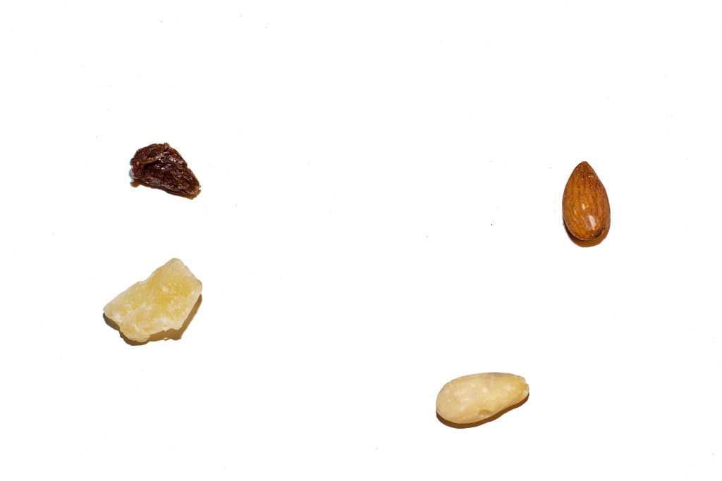
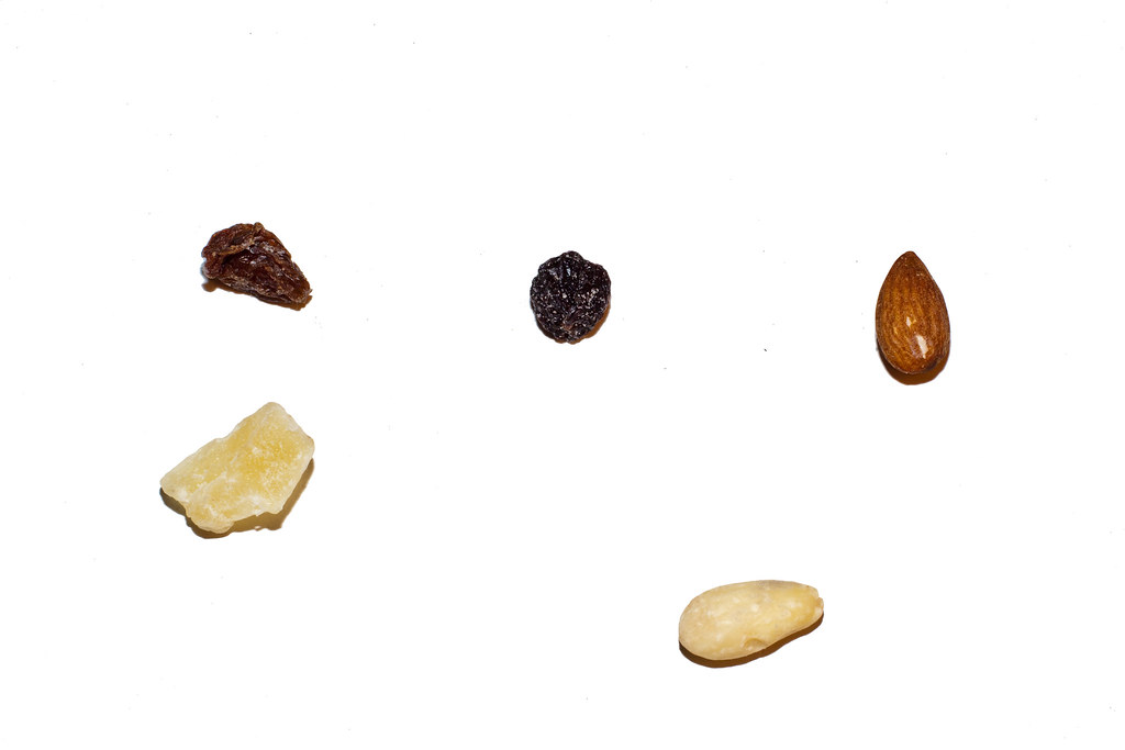
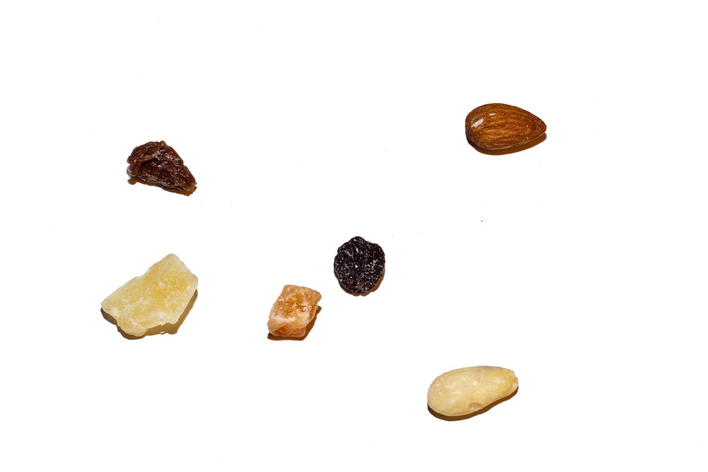
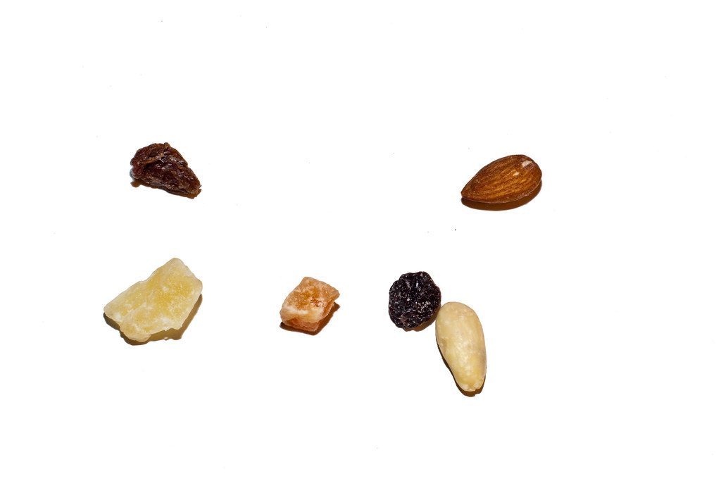
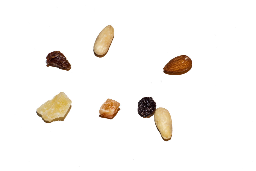
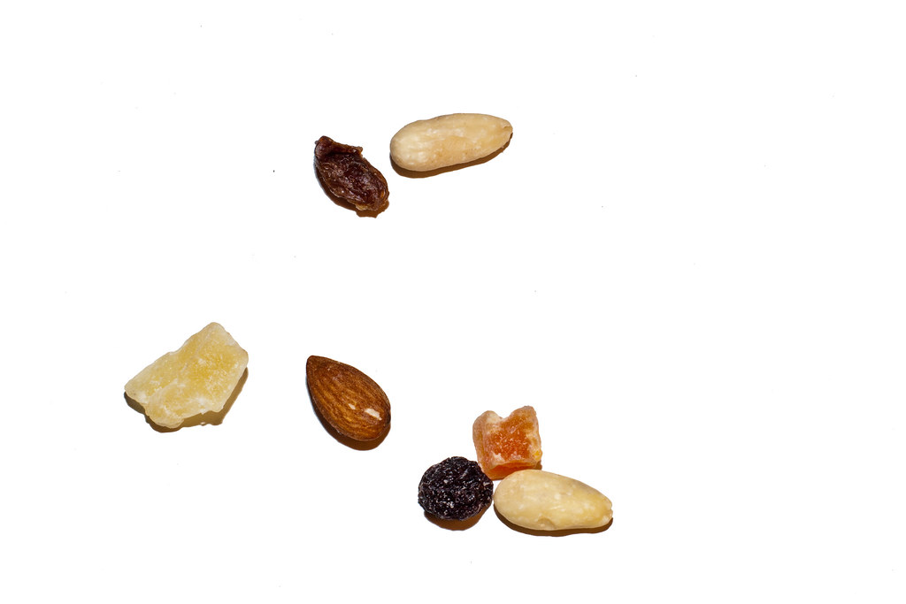
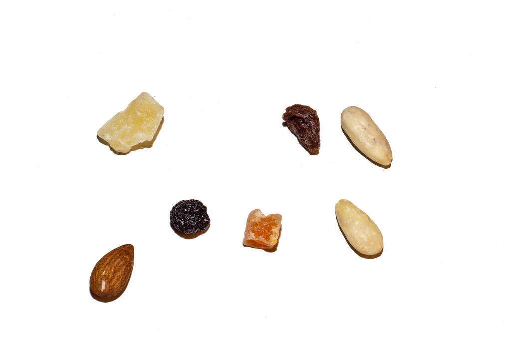
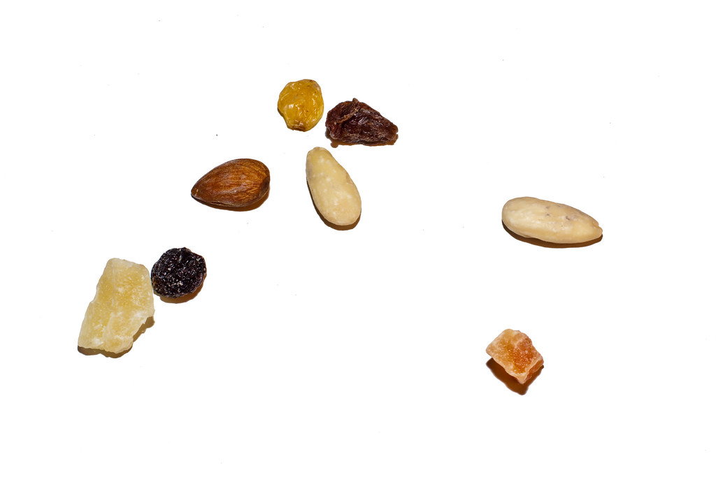
Exercise: Rhythms and Patterns

Pattern


By taking this picture from a bridge at night, of the hundred of people watching a concert, the high point of view allowed the image to produce a pattern of irregular but recognisible shapes. 


Rhythm


The positions of the knobs, the names and variation on the labels make a sequence with a variations and repetitions combined.

Exercise: Real and implied triangle

In this exercise, with 6 photographs of triangles we compare the different types.


Subject which is a triangular

This is quite an obvious choice, the triangle used as a danger warning.
Shot on top of "Rocher de Naye".


Make a triangle by perspective, converging towards the top of the frame.

Using the camera's lens perspective the two buildings imply several triangles.
"shot in sebeillon"


Make an inverted triangle by perspectivve


Using the roof of the market  produces the inverted triangle with the apex pointing towards the bottom.
shot in Budapest.


Make a still-life arrangement to produce a triangle with the apex at the top

Placing the cactus this way produces the required triangle


Make a still-life arrangement to produce an inverted triangle, with the apex at the bottom

Placing the cactus this way produces the required inverted triangle, I find it not easy to notice in real life situations,


Arrange 3 people to make a triangle


Here the three heads form a triangle as much as their body positions.
Flava Flav and chuck D from the pioneer old school hip hop band Public Enemy, with a person from the crowd, shot in Lausanne at a concert.

Exercise: Implied Lines

2 photographs, eye line, extension of line

3 photo to analyse

 Here the implied lines would be the curved path lead by the tree shadows, it's the only sense of direction and therefore leads the eye from the center then up the  right side of the frame. I admit it's not necessarily very strong here.


In this one, the movement of the people gives a sense of direction through their body language.
All people getting out of the metro are going to the right of the frame. In this case, people had no reason to go to the other side as it lead nowhere. I can imagine this could help in predicting the composition in advance, knowing where people will naturally go towards to.


The implied lines of the lights combined with the mettalic cylinder support draws the attention to the woman at the door of the metro. In this image we can easily fill in the gaps between existing lines being covered.


Eye Line


In this image, the woman looking in the distance could have been used for an eye - line effect. Unfortunately, there wasn't any subject included in the frame. However, following her eye line makes you notice the two persons in the background.


Here, both subjects are used for their eye line. The dog is looking at the woman and vice-versa, both eye lines build up a strong relationship between the subject.

Exercise: Curves

Curves


Not sure this is the most obvious curve example but I've chosen this one for the tracks left by cars on the snow. I could imagine how deeper tracks could create curvy shapes.
Here we can see slight curves increased at the top of the frame.


Again, not the most obvious choice for curve but the shape of this old telephone is indeed more curvy than our modern phones.
the curves  are used both for design purposes and comfort in usage.


In this image, the curved path directs the eye from the bottom left of the frame to the top of the path stairs, where a woman is standing. It's amazing how in control of the viewers eye you n be by using curves. It's definitely something to use to the photographers advantage.


The Rolex Learning Center in Lausanne is full of curves and weird shapes, but curves are the main trend


Exercise 2: Diagonals

Diagonals


The stairs has the diagonal feel of it, I artificially implied more diagonals by tilting the camera to the left


Diagonal lines like these are often seen on machines, speakers, fences.
 Why diagonal and not horizontal and vertical? I can imagine on a fence it gives a higher sense of privacy but why would it be useful in the picture above? 


Even though diagonals can be seen throughout the whole picture the way it's been composed is very confusing to the eye. Yet, there is still something I like about it but I would agree it's not in favour of the diagonals.


This picture of the metro station in Budapest is tricky for me to analyse. On one hand there are many diagonals (at least implied), on the other hand there are many implied triangles. We'll all agree a triangle is composed of diagonals but the opposite isn't true. In this case I think both diagonals and implied triangles can be seen.


Using a telephoto lens at an angle on this building produced repetitive patterns of windows and balconies making diagonal lines.

Exercise 1: Horizontal and vertical lines

Vertical Lines


Many monuments use vertical lines,The higher it is the greater the sense of being dominant is increased


Buildings use many vertical lines, especially skyscrapers


Trees are natural verticals

Lamp posts can be compared to trees, but as man made verticals


Vertical Lines aim to the sky, and can be seen as overpowering. I believe it could be seen as superior, more powerful, intimidating or even spiritual. Verticals are often aiming beyond the reach of human beings, I think this can be used effectively in how an image can be perceived.


Horizontal lines

These Row of benches present horizontal lines

This industrial metallic wall uses horizontal lines, probably due to massive manufacturing of the material


Although vertical lines can be seen here, the perspective makes the horizontal lines more dominant and  provide stability.


The horizontal lines of this metro gives continuity and one can imagine the extensions on both sides of the frame.


How does Horizontal lines work for design?
I think the key element is the fact that horizontal lines  show stability in relation to gravity, filling the condition that it graphically parallels the ground as much as possible. It will most certainly create less tension than with other lines. Being used to seeing horizontal frames in advertisement, TV or the camera's viewfinder I believe we feel more at peace with horizontal lines. Could this make the picture a bit dull or boring?


Multiple points set


This is the whole set picture by picture from the slideshow


This picture above is my final composition. Although it may be very abstract what is pleasing to one or another I can see the benefits of moving the objects around.


Exercise 3: Multiple points

6 photographs.

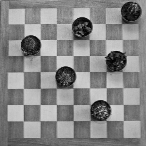
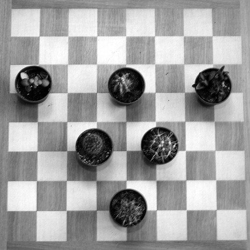
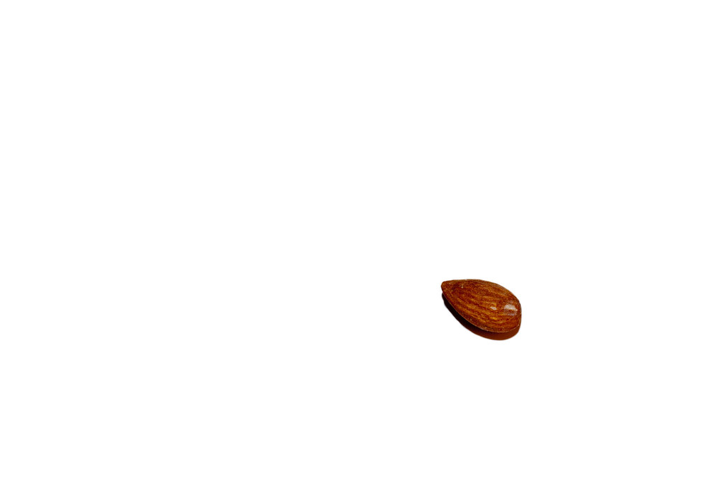
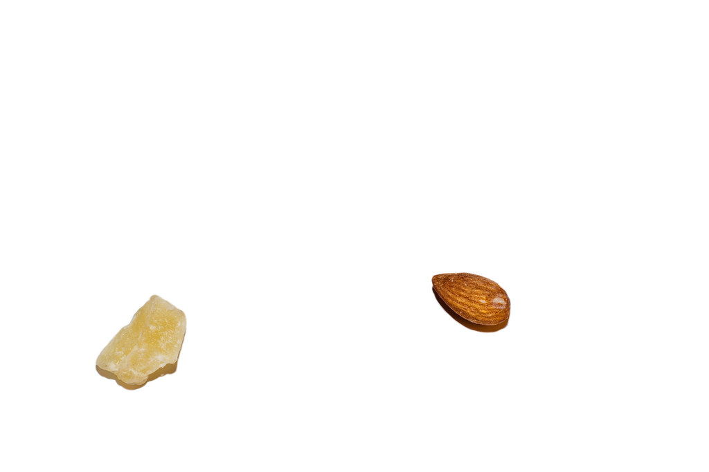
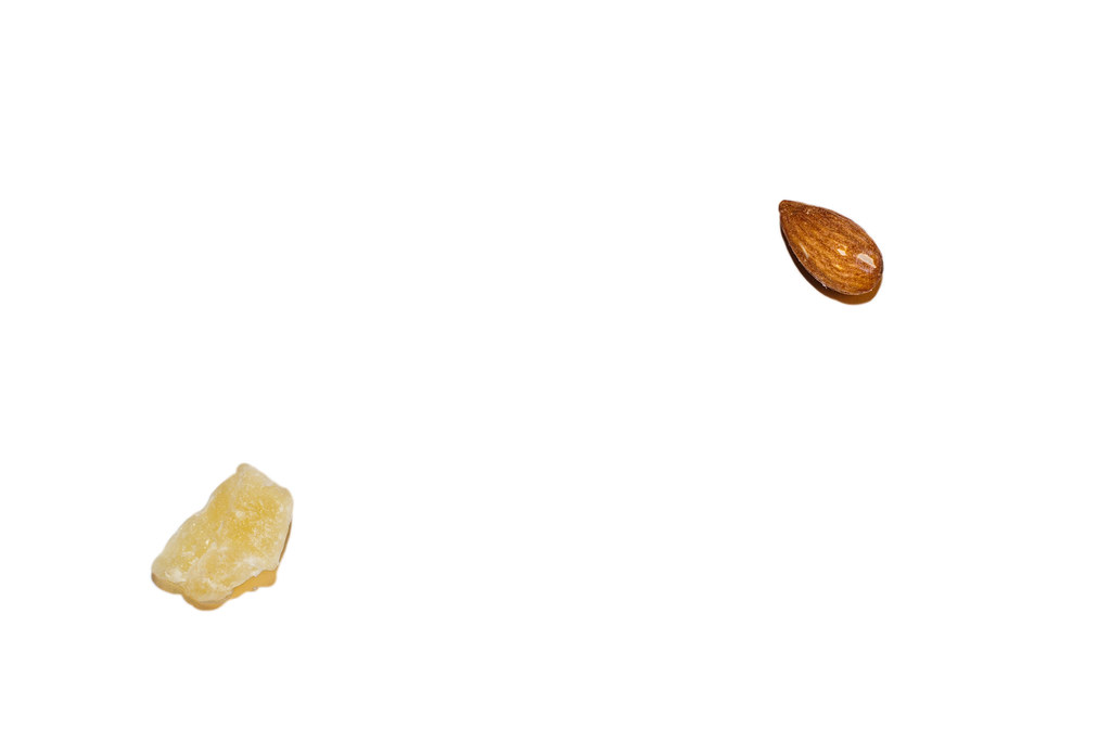
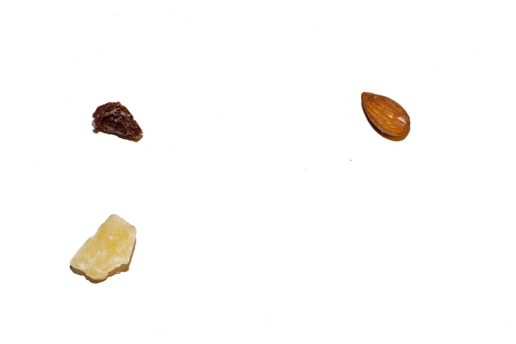
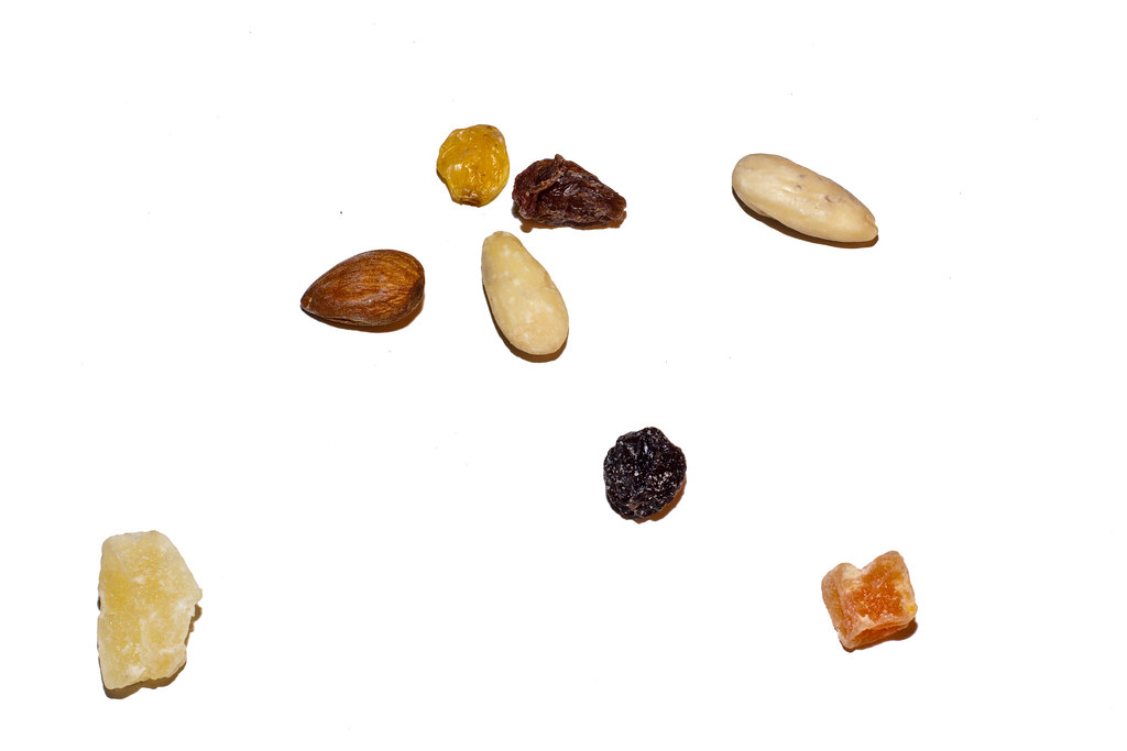
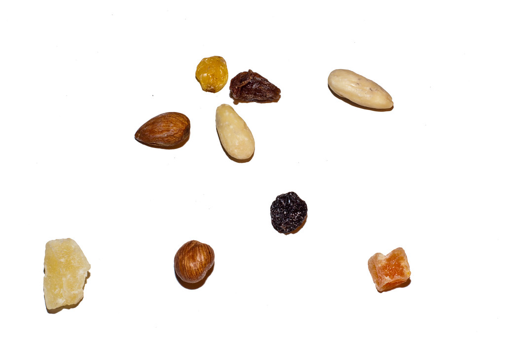
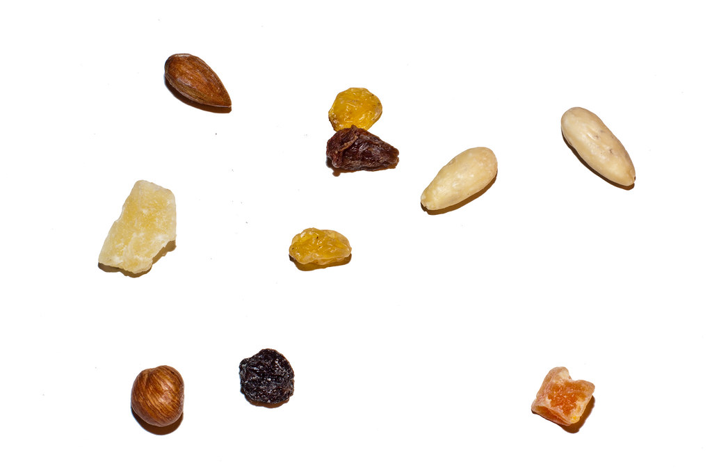
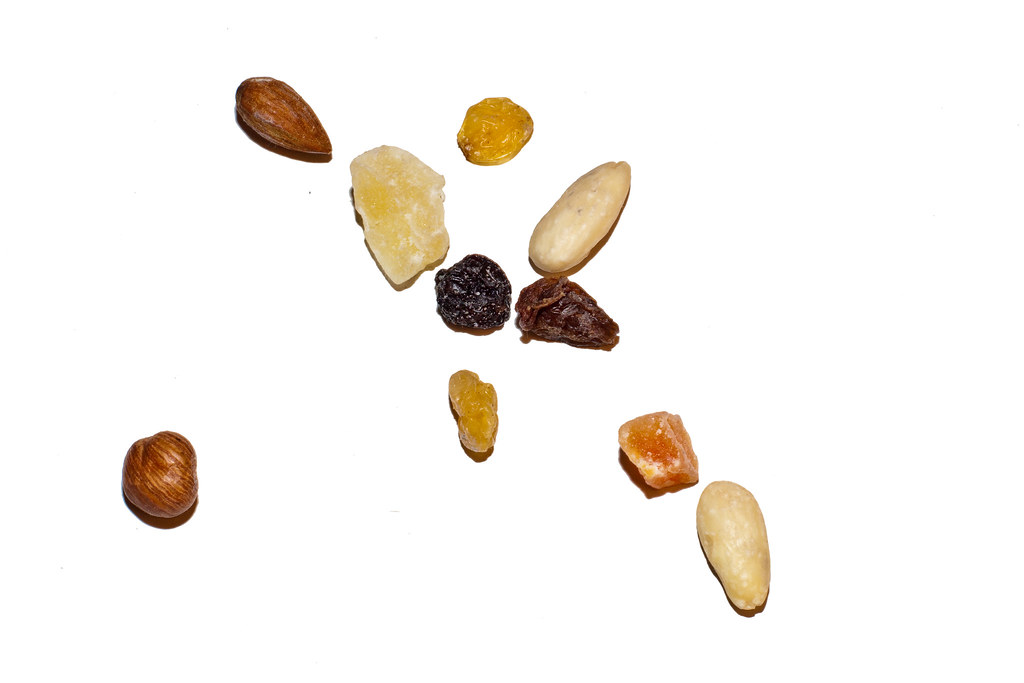
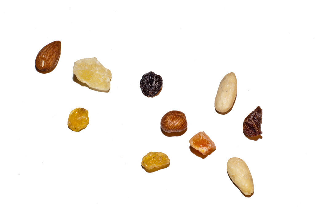
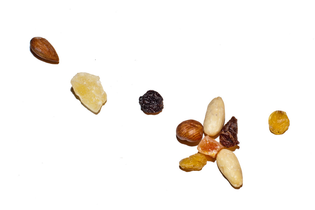
In this exercise the aim is to create a composition of a still life made with 10 objects, with a sequence of photographs of the placed objects, 1 by one.

I have decided to use a plain background, even though an uneven background was suggested in the exercise.

I have placed one by one dried nuts and fruits on a white cardboard box.
A tripod, flash and 50mm lense were used.

All pictures have been processed the same way through an automatic photoshop script, automating an action
I had created processing the first image.
I adjusted white balance, exposure, contrast In Adobe Raw. The file was then sent to photoshop and the white background has been repainted white as the original one wasn't usable.


You can view the set through the following slideshow or view the picture set via the link below it.


This exercise was vey helpful in realising how difficult it is when you have the freedom of being totally in control. A still life composition such as this one carry so many tweakable variables it can become overhelming.
This one being my first, I had a hard time choosing the background and something I could light up easily. Having no lighting system I relied on my flash and post processing on Photoshop, I used a white cardboard as the background which had nasty reflections caused by the flash. 

When it comes to the positions of the elements it could take forever to find the correct match as the possibilities are almost endless. However, What I've found out is the composition is usually more appealing with odd numbers of elements. Although, from 5 elements and up the eye tends not to count the number of elements anymore but somehow, it seems to be pleased by odd numbers.

Placing the elements is key. I honestly thought just throwing 10 nuts  like a handfull of dices on a white background wouldn't look dramatically different from a carefully planned composition. While this could sometimes work it's much more efficient making your own decisions and trying out different scenarios.
In this simple exercise it was easy to see the way the elements were displayed could radically change the whole dynamic of the image.

Exercise 2: The Relationship between points

For this exercise I will use 2 similar objects in order to focus on the relationship between the points.


It's hard to say in this one which attracts more attention than the other. The eye is drawn from one to the other  but we assume they are both going towards the top right corner of the frame, giving a sense of direction.


I believe the position of the red coaster  attracts more attention as it is closer to the center.


The position of the two elements, similar to human eyes, makes them attract attention equally