Showing posts with label Exercises TAOP 3. Show all posts

Exercise: Colours into tones in black and white

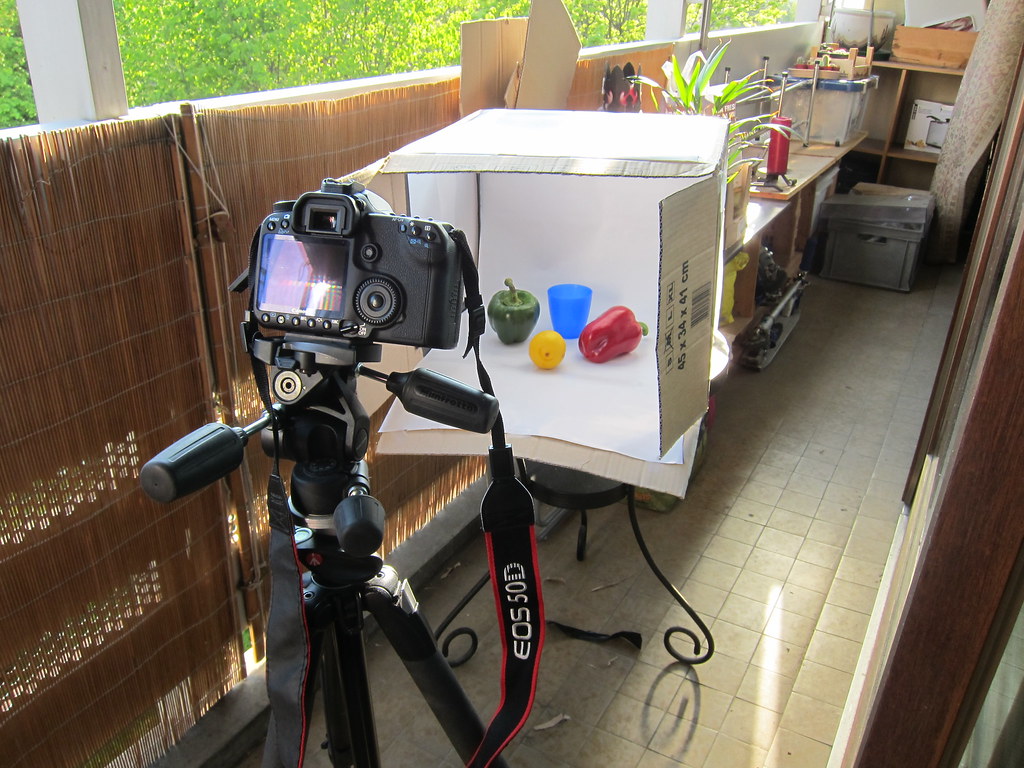
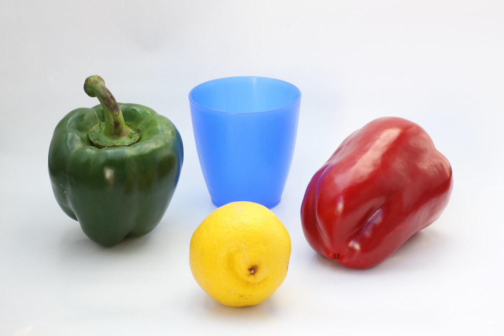
For this Exercise I've built a DIY lightbox (more info here). I've placed a green and a red pepper, a lemon and a blue plastic glass against a white background. Before arranging the still life I took a shot of the white background and set it to my custom in-camera white balance.

I've used natural daylight, set up my tripod and in aperture priority mode with a f/16 aperture. I've also used a remote release to minimise any camera movement. 


Here's the setup:


Original shot:

50mm, f/16, 0.25s, +1 ev, ISO 100

I then used Picnik to process the file as Photoshop wasn't available to me. I've simply used the black and white filter for this next shot.
Black and white, no filter:
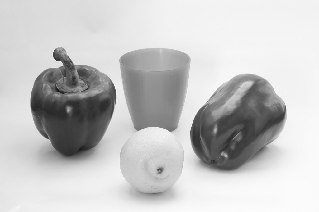


Black and white, yellow filter (I eye picked in picnik a yellow that seemed yellow to my eye):
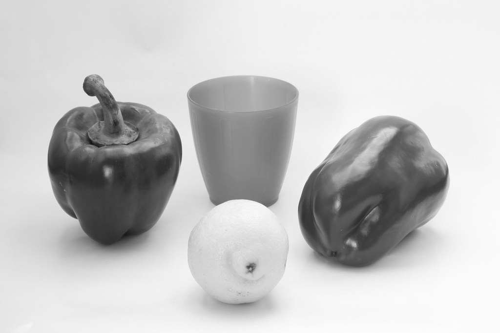

Although the effect is not so obvious, the yellow lemon appears lighter and the whole image too.

Now, I'll try with the red filter:

Black and white, red filter:
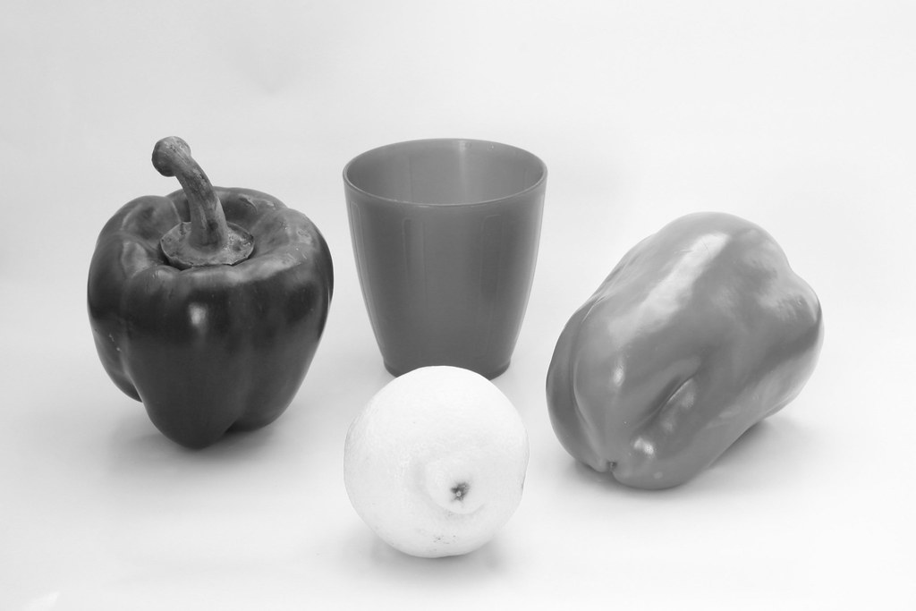

I'm surprised at the result here, although the red pepper appearing lighter was expected I don't really understand why the lemon appears a lot lighter than with the yellow filter.

Black and white, Blue filter:
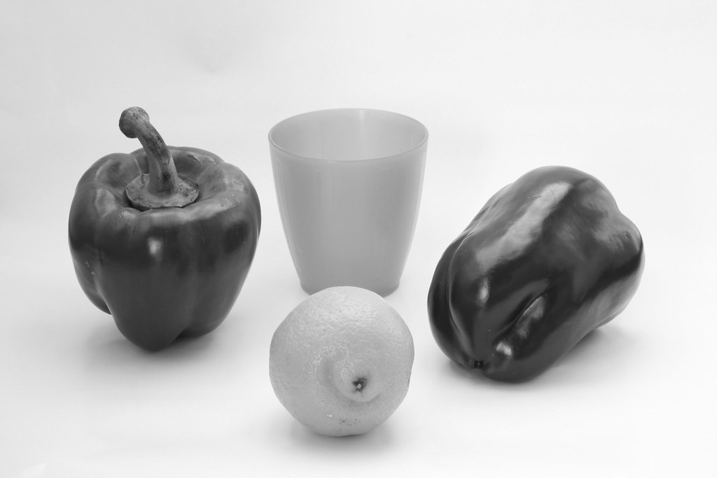

Blue appears lighter as expected, other colours appear darker, making the lemon almost in the same tone as the blue glass and both peppers look as if they were ion the same tone too.

Black and white, green filter:
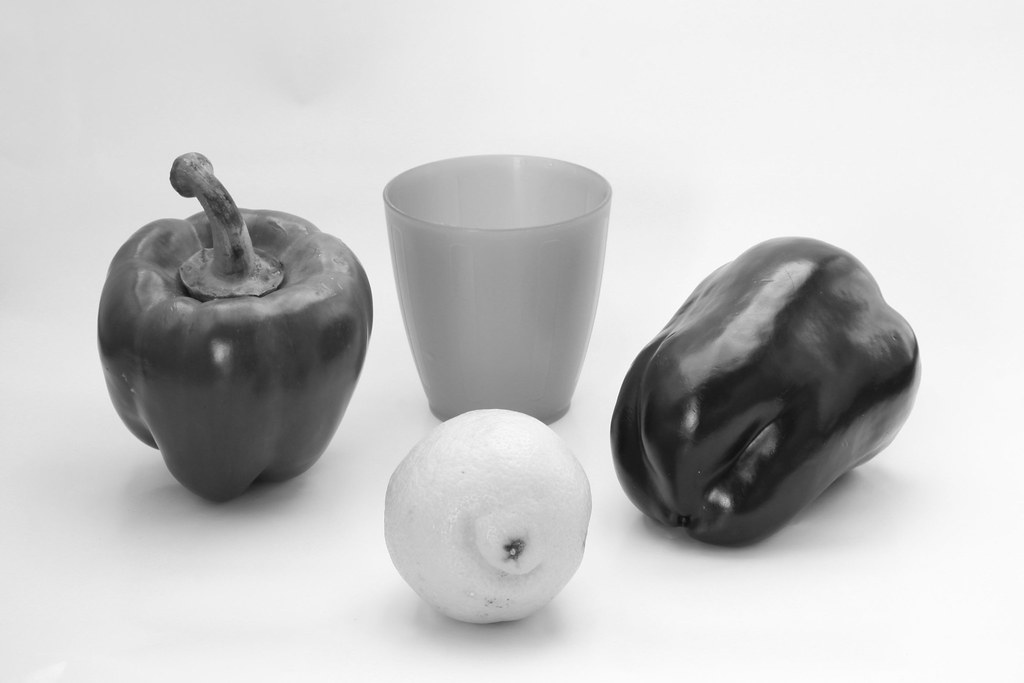

The green pepper does look a bit lighter here but the effect is more noticeable on the red pepper appearing darker and the lemon appearing lighter but with more contrast.

I believe the choice of the original colours influences the effect of the filters. It would also be interesting finding out how using the photoshop filters could make a difference.

Exercise: Colour relationships

Combination of primary and secondary colours


1) Red / Green = 1:1


2) Orange / Blue = 1:2


3) Yellow / Violet = 1:3


3 photos of combination I choose appealing


I realised quickly that most of my pictures have never really been colour oriented so I looked into the few ones that did contain colours as part of the interest.


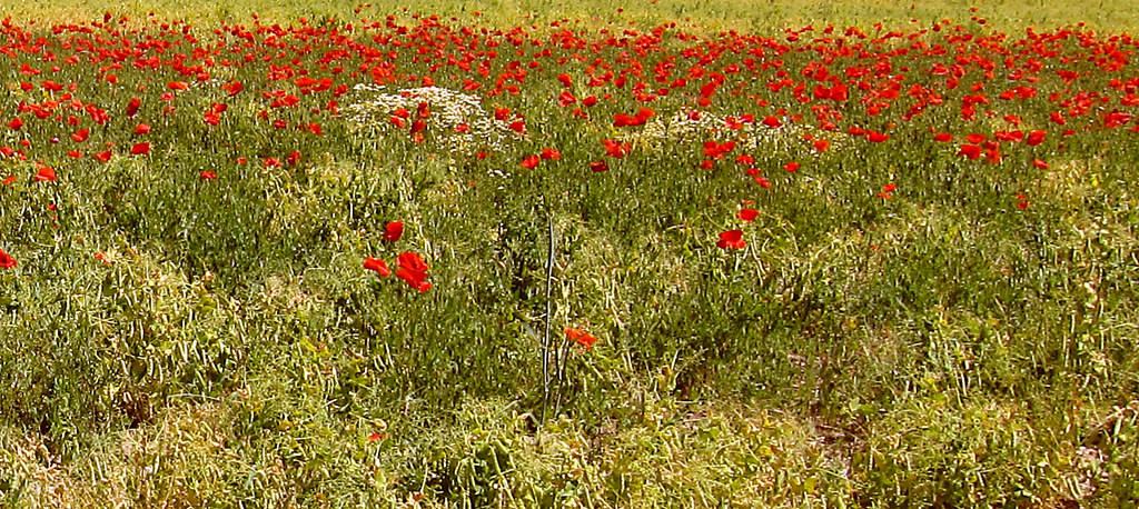
This Picture is more difficult to analyse. Many colours come to mind: Yellow, Blue, Red, green and shades of all of them. They all stand out against the grey, white snow around. It's appealing in some way and at the same time a bit disturbing. Overall, I think it makes it interesting
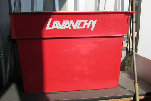


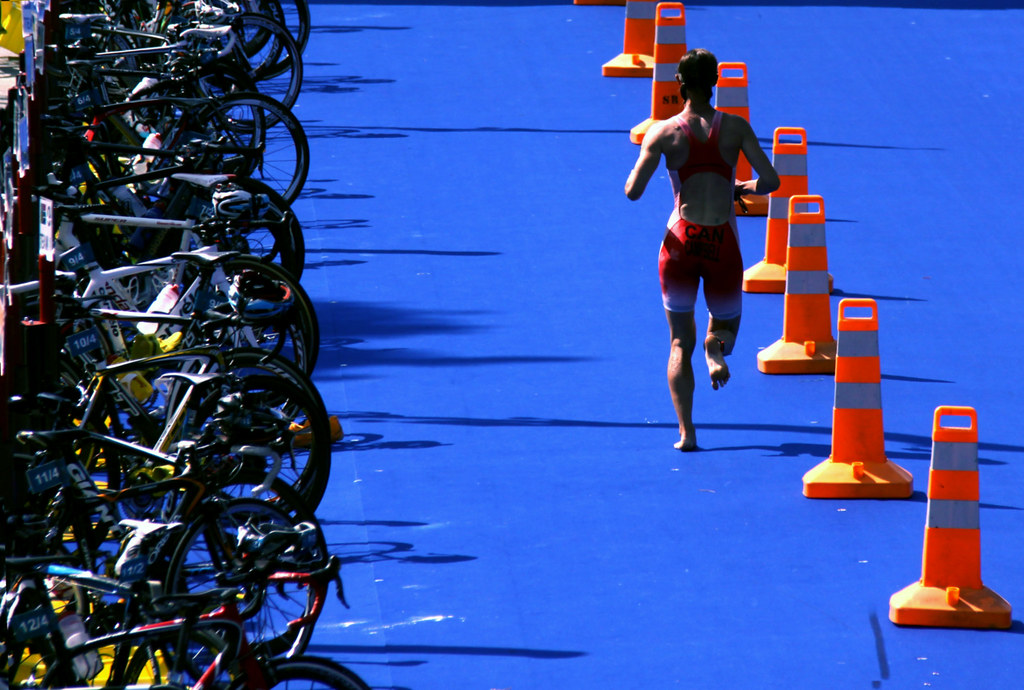
This Street scene would certainly not look appealing at all without the contrast between Blue and Orange. Giving a bit of life to this otherwise very grey scenery.


Although I agree one can argue it isn't the most appealing scene Colour does help to improve it, the red light and the blue trash add something to the picture despite it's unattractiveness.


Exercise: Primary and secondary colours

Photos of primary and secondary colours


6 photo x 3 manual exposure, for each photo  make  -1/2, 0, +1/2 stop.


To make things easier I used simple coloured objects against a seamless white background using my DIY lightbox


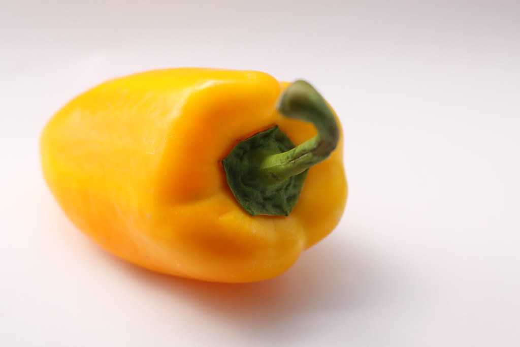
Yellow

50mm, f/2.8, ISO 100, O EV


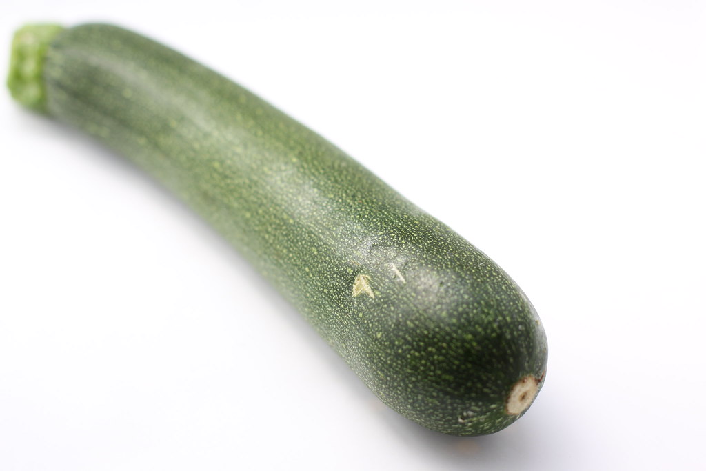
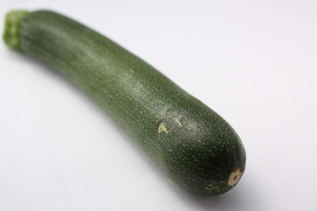
Green

Canon EOS 50D
50 mm, 1/250s, f/2.8, ISO 100, +1/2 EV


Canon EOS 50D


50 mm, 1/500s, f/2.8, ISO 100, 0 EV
Canon EOS 50D


50 mm, 1/500s, f/2.8, ISO 100, -1/2 EV

Orange:

Canon EOS 50D


50 mm, 1/3000s, f/2.0, ISO 100, +1/2 EV

Canon EOS 50D


50 mm, 1/4000s, f/2.0, ISO 100, 0 EV

Canon EOS 50D


50 mm, 1/6000s, f/2.0, ISO 100, -1/2 EV


Blue
Canon EOS 50D


50 mm, 1/15s, f/16.0, ISO 100, +1/2 EV

Canon EOS 50D


50 mm, 1/20s, f/16.0, ISO 100, 0 EV

Canon EOS 50D


50 mm, 1/20s, f/16.0, ISO 100, -1/2 EV
Red

Canon EOS 50D


50 mm, 1/6s, f/16.0, ISO 100, +1 EV
Canon EOS 50D


50 mm, 1/20s, f/16.0, ISO 100, +1/2 EV

Canon EOS 50D


50 mm, 1/30s, f/16.0, ISO 100, 0 EV

Canon EOS 50D


50 mm, 1/45s, f/16.0, ISO 100, -1/2 EV
Blue

Canon EOS 50D


50 mm, 1/8s, f/16.0, ISO 100, +1 EV

Canon EOS 50D


50 mm, 1/10s, f/16.0, ISO 100, +1/2 EV

Canon EOS 50D


50 mm, 1/15s, f/16.0, ISO 100, 0 EV

Canon EOS 50D


50 mm, 1/20s, f/16.0, ISO 100, -1/2 EV
Yellow

Canon EOS 50D


50 mm, 1/10s, f/16.0, ISO 100, +1 EV

Canon EOS 50D


50 mm, 1/15s, f/16.0, ISO 100, +1/2 EV

Canon EOS 50D


50 mm, 1/30s, f/16.0, ISO 100, -1/2 EV


After analysing each exposures with each colour the effect of exposure is clearly affecting colour, and differently for each of them.


I think keeping these images as a reference to help anticipate the effect of exposure when mixing colours would be useful. Although the test would probably be best done under strict conditions like similar lighting conditions, Accurate white balance, etc ..


DIY Light box

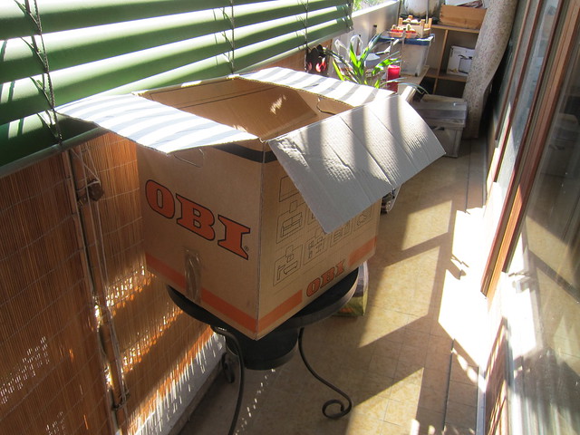
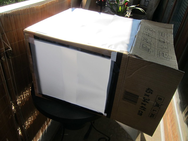
As shooting still life is sometimes a requirement and having experienced how hard it was doing so without proper equipment I've decided to build my own light box.
Here's a breakdown of the material I've used:

-Cardboard box
-Tracing paper
-Duct Tape
-Gift wrapping paper


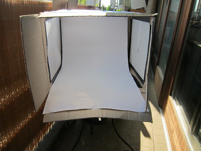
I went for quite a big box, allowing me more flexibility or perhaps shooting vertically.


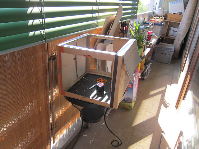
I then cut square holes on the sides and added some duct tape to make it more sturdy.


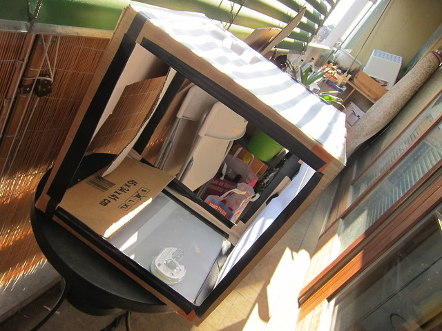
I then taped tracing paper on top of the square holes.


For the seamless background I used gift wrapping paper. Even though I went to a specialist store finding anything else than A4 print paper seems to be quite a challenge in Switzerland. the wrapping paper is originally yellow, using the back of it seemed to do the trick and I hoped it wouldn't do any colour cast. Anyway, for the time being that's all I have.


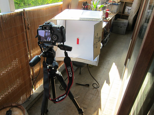
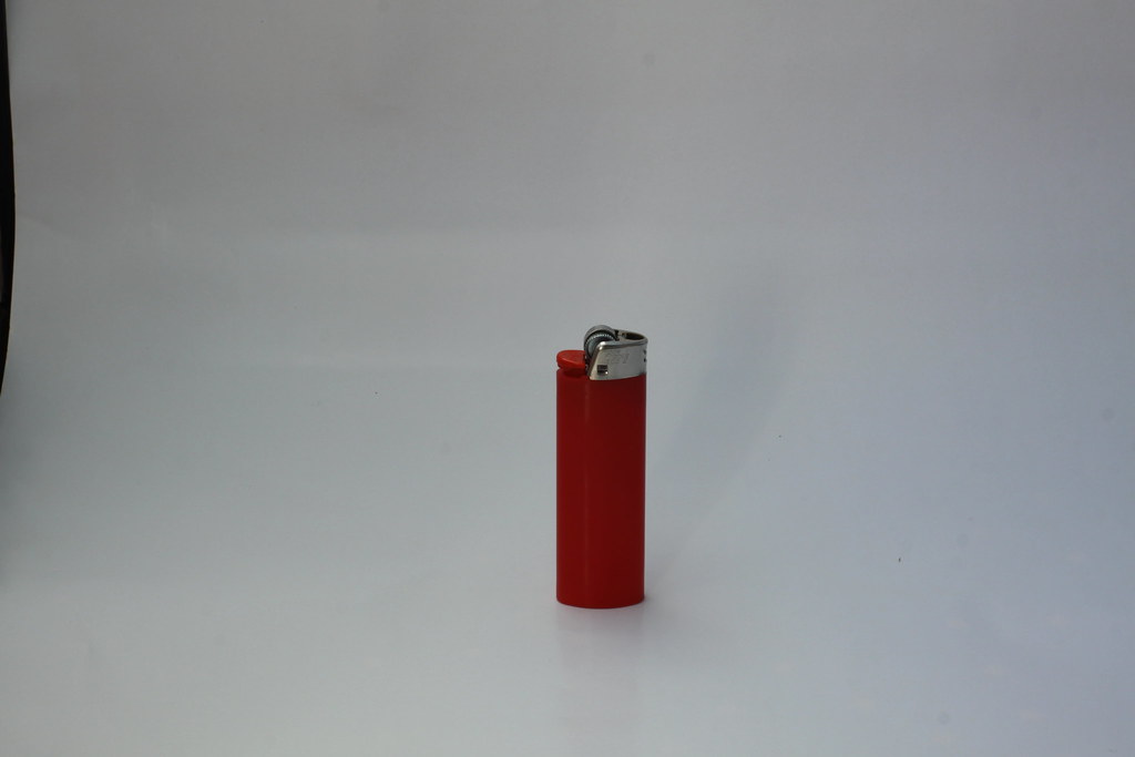
I was then ready to make a test shot, I just used a simple lighter and although the paper does have a few "wrinckles" I'm quite happy about it. I'm hoping to improve it with time and customise it along the way.


After reviewing my test shot and seeing the background turned out dark grey I thought it would be useful to create a custom white balance by taking a shot with the white background filling the frame, then setting it to the cameras custom balance mode. 

Exercise: Control the strength of a colour

5 photographs

Shooting Manual:

Find a strong definite colour, fills frame


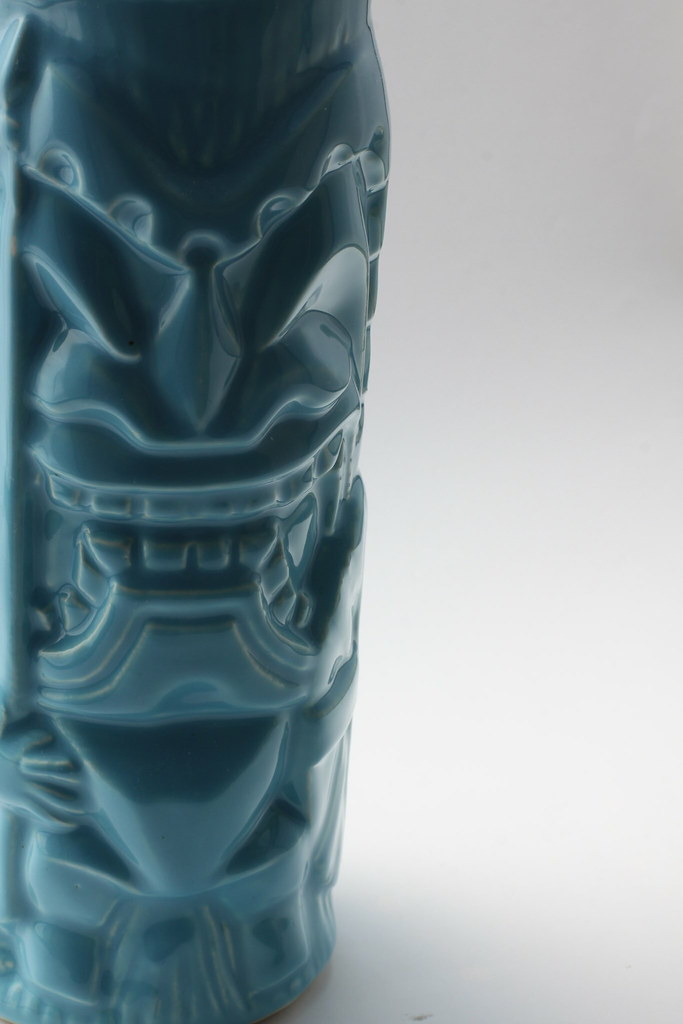
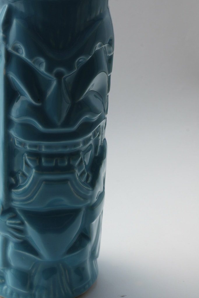
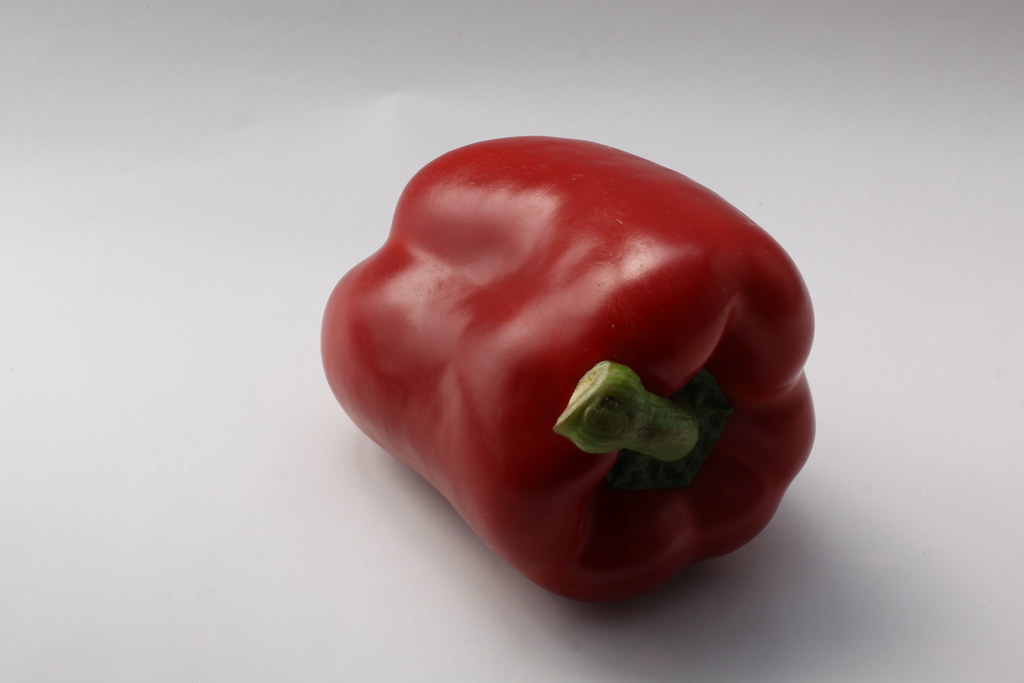
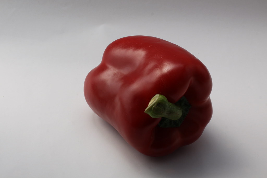
This is the object I've used for this exercise:


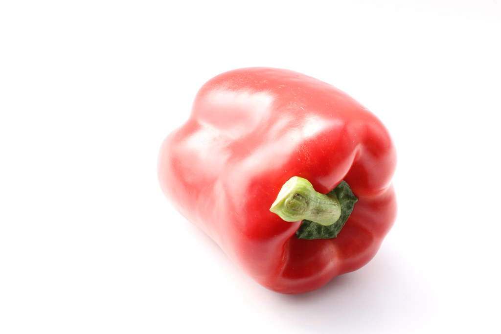
Normal exposure:

50mm, f/8.0, 1/320s,  ISO 100, EV 0


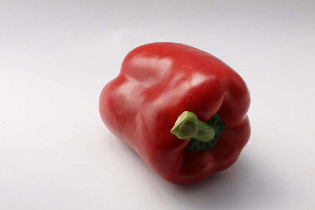
50mm, f/8.0, 1/160s, ISO 100, EV +1


50mm, f/8.0, 1/250s, ISO 100, EV +2/3


50mm, f/8.0, 1/250s, ISO 100, EV +1/3


50mm, f/8.0, 1/400s, ISO 100, EV +0


50mm, f/8.0, 1/500s, ISO 100, EV -1/3


50mm, f/8.0, 1/500s, ISO 100, EV -2/3


50mm, f/8.0, 1/800s, ISO 100, EV -1

Overall, Increasing the exposure value makes the colour more washed out and decreasing it more saturated. My favourite Red here is probably the -1/3 EV.


This makes it an important thing to remember when photographing colours, it might make it more appealing to me to slightly decrease the exposure or trying different ones when colour is a main feature of an image.