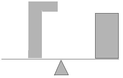
The concept of balance is fairly easy to understand in theory, especially when analysed with a weighing scale or simple geometric shapes. Analysing balance in my own photographs is really a challenge to me.
My approach at this exercise will be to note down at first glance whether or not the image is balanced or not.
Then, through analysing the image more deeply I'll compare my initial perception with my second judgement.
 1st glance:
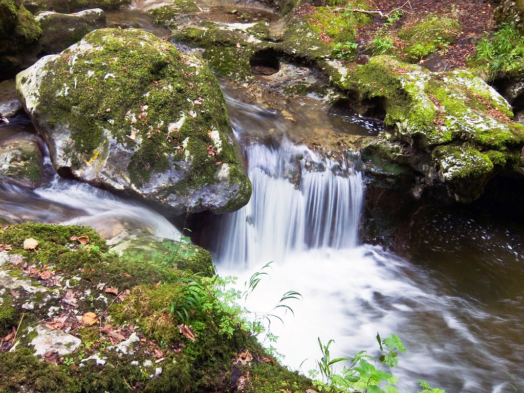
The image looks balanced to me. Although something is bothering me, I feel like rotating it anti-clockwise for some reason.
After analysis: The stone carries more weight but the water takes more space, it's still hard to say whether the weighing scale would fall to the right or if it's balanced after all. However, I see it as balanced.
1st glance:
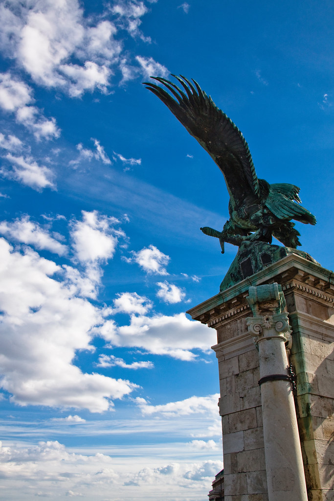
Again, I feel it's blanced to my eye. The clowds to the left and the statue to the right carry the same weight.
Again, I feel it's blanced to my eye. The clowds to the left and the statue to the right carry the same weight.

 After analysis: I assume the sky does carry some weight. I think it is an important element of the picture. the clouds add something and I feel it's balanced with the statue of the bird. I feel there is some movement that start at the bottom right of the frame and extends to the left through the wings and then with the clouds moving towards the left.
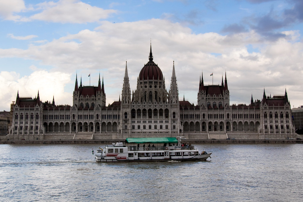 1st glance:
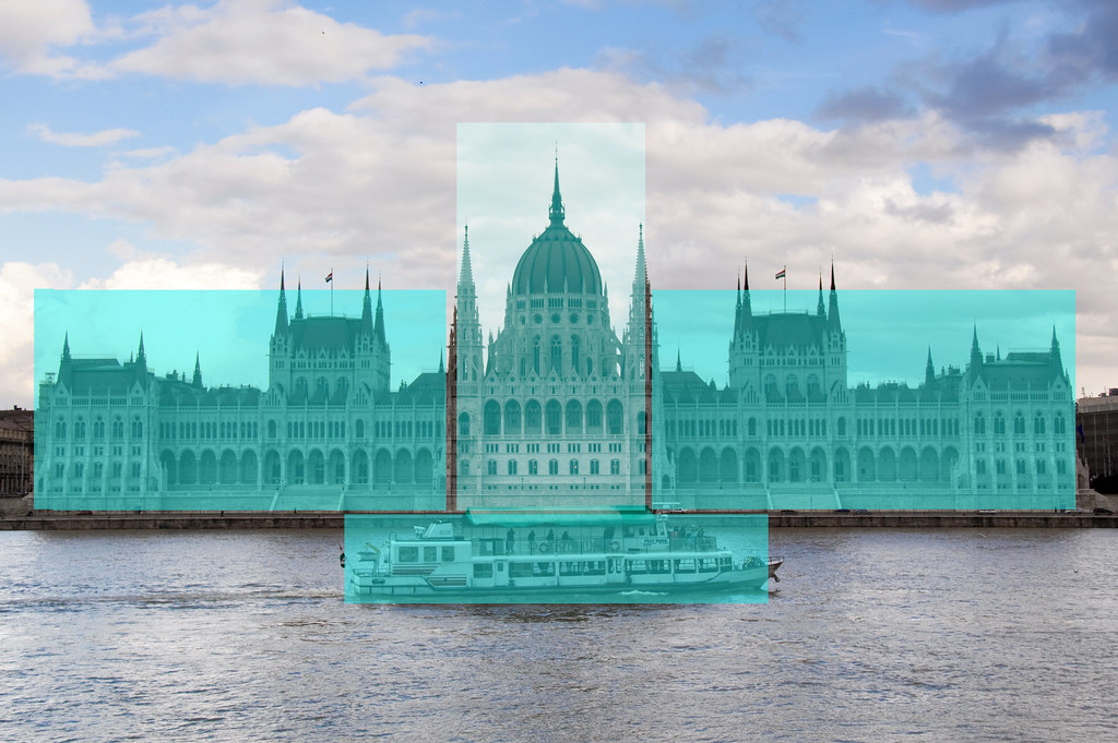 After Analysis: I think each side of the building carry the same weight in the picture. The weight of the boat being in the center but slightly bending to the left and slightly off center to the right keeps the balance ok. I'd say the picture is balance through it's opposite unbalanced areas.
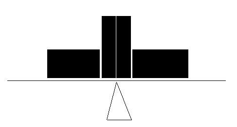
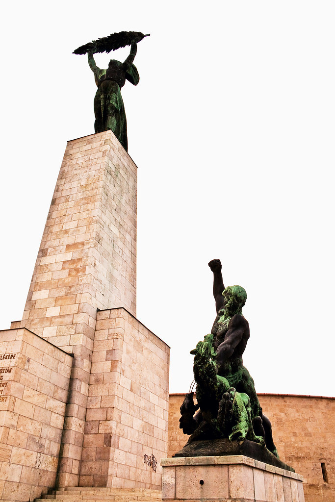 1st glance: The picture is not balanced. I feel there is tension in this image but that doesn't make it balanced
 After analysis:The weight of the higher statue is bigger than the other one, the blown out sky doesn't weigh anything. However, it is hard to judge as the statue on the left is leaning to the right. I feel there is more tension than balance but it makes the image interesting to me.
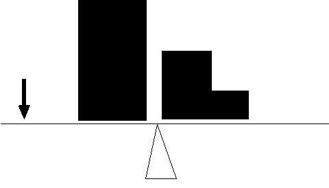
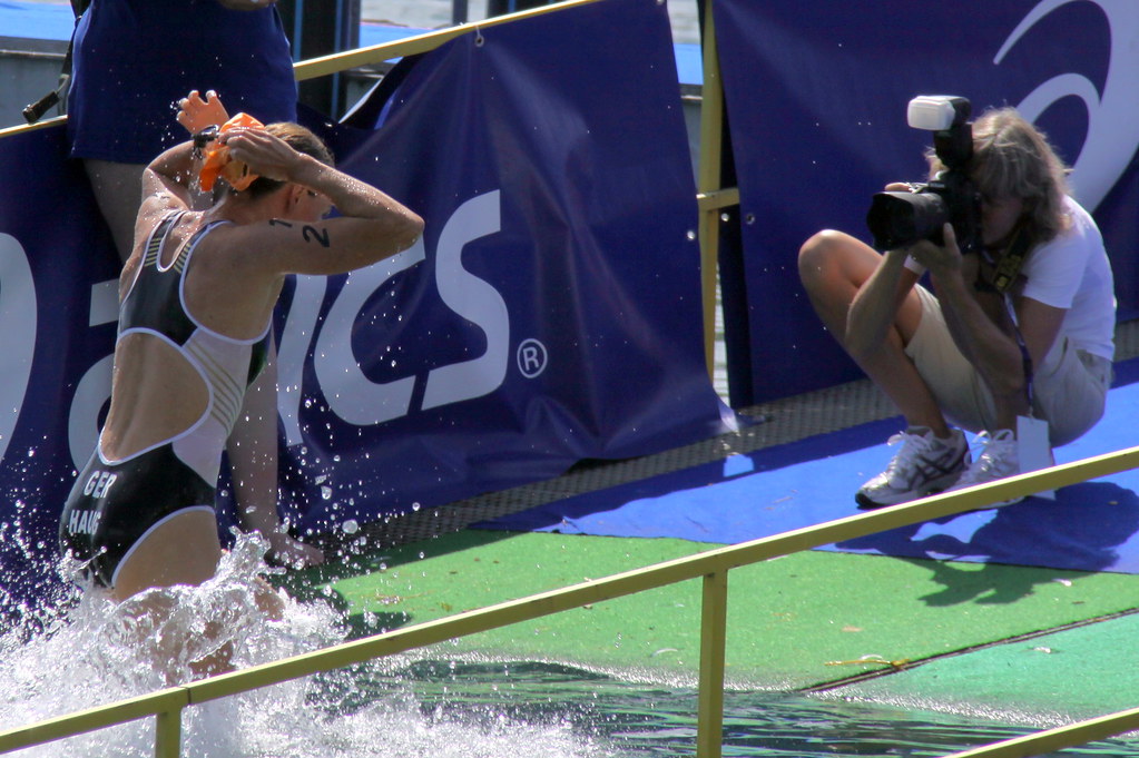
1st glance:
It looks balanced to me.
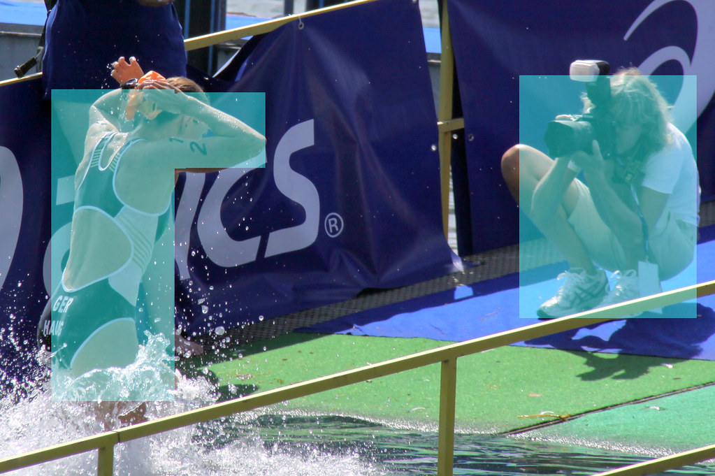
After analysis:
The athlete being bigger but closer to the center of the frame with the photographer being closer to the right edge of the frame I would say they outweigh themselves. I'm not totally sure that would be the way to see it but I don't see other elements in the picture that would weigh anything. It still looks balanced to me.

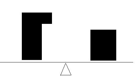
1st glance: not really sure if it's balanced or not but it doesn't bother me much in this picture.
After analysis: It's not easy evaluating the weight of the clouds against the blue sky.
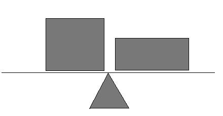
If they had an equal weight then the picture would be balanced, if not there is more weight on the left side of the scale as shown on the diagram.

If the pictures chosen were minimalist it would sure be easier to analyse the balance of it. Having many elements that weigh out subjectively doesn't make the concept of balance easy to understand. I hope with time it will be more obvious to me.
No comments:
Post a Comment