In this assignment I really struggled again to find the right subjects. In everyday life, apart from advertising and Brand names, colours aren't wide spread. Most buildings in Switzerland have washed out colours or are grey, shops are about the same. People in the streets only wear bright colours in summer. Overall, it doesn't matter where you are but colours are quite hard to find when you're left with no control over it.
This reflects the subjects I chose for this assignment, a mix of still-life (controlled), a bit of luck with street people or subjects and a touch
of creativity when I was left with no other options available to me. Far from mastering the colour subject I'm now aware of the possibilities and hope to treat this element as part of my future compositions whenever possible.
Colour Harmony through Complementary colours
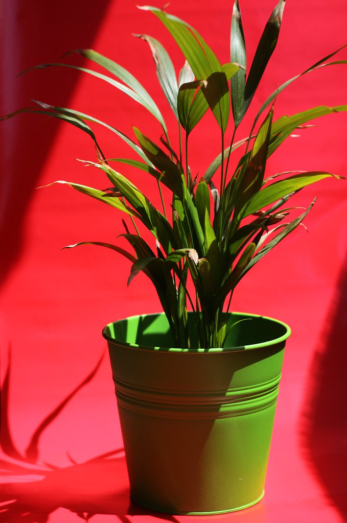
Red - Green
An obvious choice for Green was to choose a plant, which is probably the most wide spread colour around us. Seeing My plant in a green pot I thought it would look good on a red background. I used red gift wrap paper as a background on my balcony, Light was not ideal and created harsh shadows but after a few attempts of controling it I actually ended up including it as it gave nice contrast to the whole picture.
This reflects the subjects I chose for this assignment, a mix of still-life (controlled), a bit of luck with street people or subjects and a touch
of creativity when I was left with no other options available to me. Far from mastering the colour subject I'm now aware of the possibilities and hope to treat this element as part of my future compositions whenever possible.
Colour Harmony through Complementary colours
Red - Green
 |
| Canon EOS 50D, 50 mm, f/2.8, 1/1500s, ISO 100, -1/2 EV |
The harsh light also helps to see how exposure can affect colour, in this case red and green.
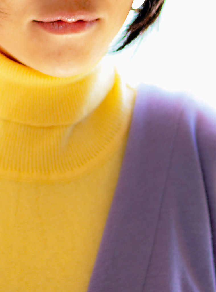
Yellow - Violet
 |
| Canon EOS 50D, 50 mm, f/2.0, 1/250, ISO 100, -1/2 EV |
As pointed out in the course material violet is not a natural colour easy to find. As I could not find any violet around me I had a little help from a friend wearing her violet bathrobe and yellow top. Her back against the sun I used spot metering on her face to meter light properly and fired the flash with a white card to create fill in light to compensate the blown up hilights in the back. The final crop was really about focusing on both main colours used.
According to the "rules" of colour balance There should have been 3 times more violet than yellow but here it's more like 2 times more yellow than violet. Breaking the rules makes it all look a bit more aggressive but does make it unusual, it might work well in some cases.
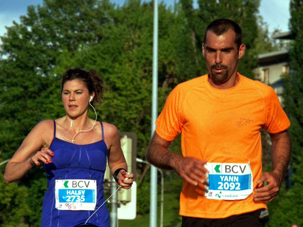
Orange - Blue
Orange - Blue
 |
| Canon EOS 50D, 120 mm, f/8.0, 1/250, ISO 100, 0 EV |
Blue and Orange, one of the hardest pair to find. I was lucky to catch these two at a race, a 20km marathon, this was around the 15th Km. Unfortunately, the balance between Blue and red isn't exactly what I wanted and the green background doesn't help.
My goal was to get the 1:2 ration for Orange/Blue and i probably achieved the opposite. Nevermind, the day I'll find those two colours in perfect proportion I'm sure I won't miss it this time.
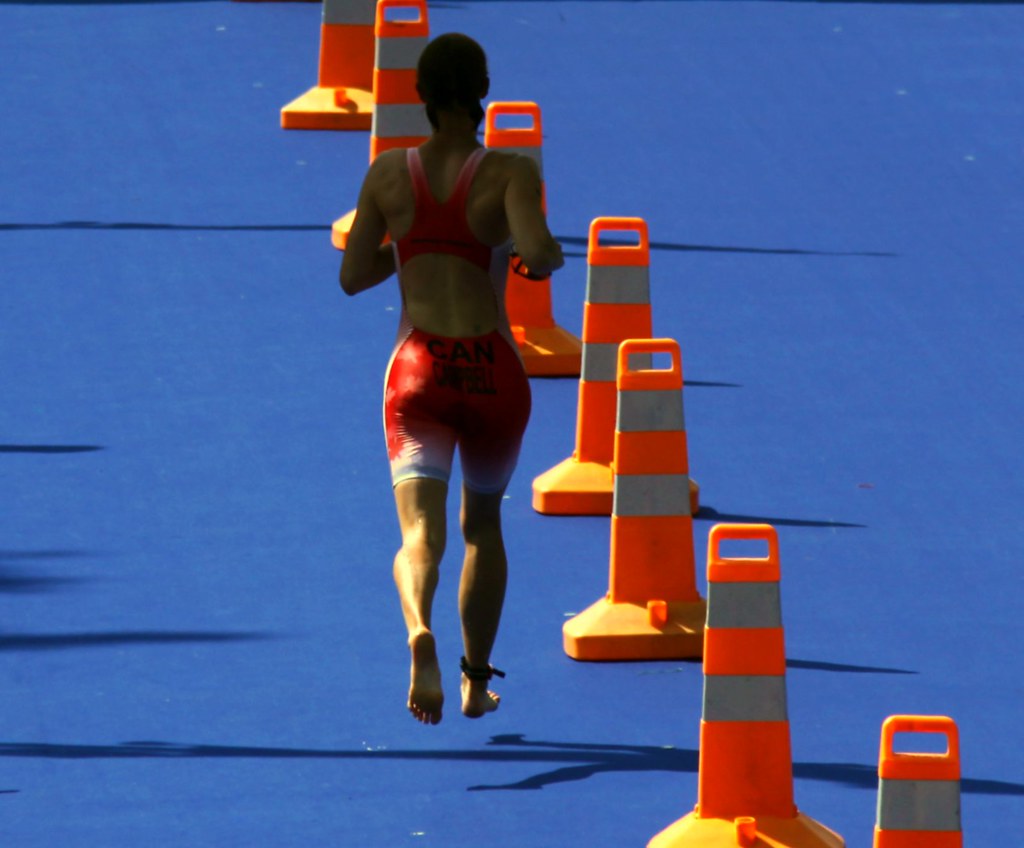
Orange - Blue
 |
| Canon EOS 50D, 160 mm, f/5.6, 1/1250, ISO 100, -1/3 EV |
This one works better in terms of proportions but still too much of blue. The Orange is very bright and it's a nice contrast with blue, these two colours work very well together but are not easy to spot, worthwile to capture.
In this case the lighting conditions wasn't ideal, Harsh shadowsincrease the difficulty.
Colour Harmony through similar Colours
Orange - Red
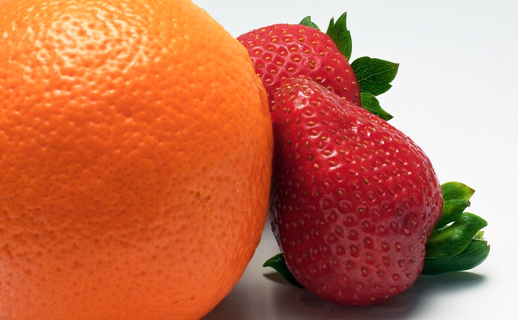 |
| Canon EOS 50D, 50 mm, f/22.0, 1/45, ISO 100, -1 EV |
Another Obvious choice for colours such as Orange and Red, an orange and a strawberry. In order to have more control over light and focused on colours I used my DIY lightbox for this shot with a tripod.
Green - Yellow
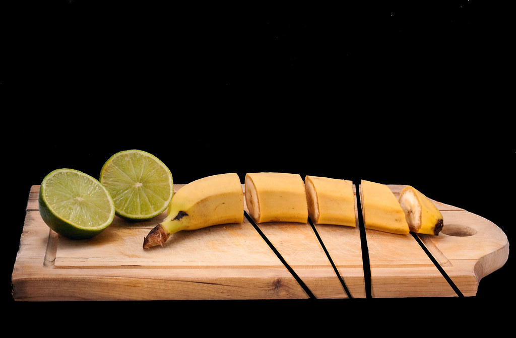 |
| Canon EOS 50D, 50 mm, f/22.0, 1/10, ISO 100, -1 EV |
After running out of "interesting ideas" and many vegetables and fruits still available I wanted to produce a still-life with a little twist to make it a bit more appealing. Indeed, I find that it's very easy to fall for a dull and safe still life but I wanted something different there. I used my DIY lightbox again and thought I'd make a composite with a few different shots. Aftery shooting the bananas and limes from different angles and positions I started cutting the banana and saw it instantly gave more interest to the whole scene. Then I had the idea of cutting the board in post production to give a little surreal result.
Blue - Green
Blue - Green
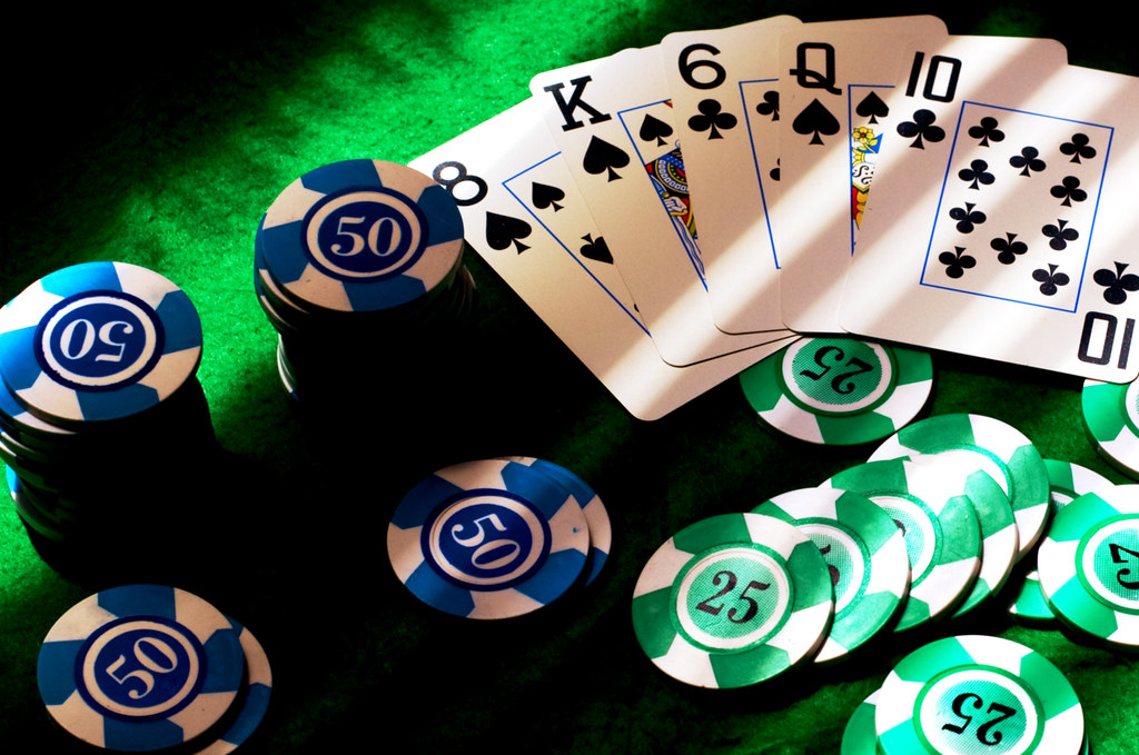 |
| Canon EOS 50D, 50 mm, f/8.0, 1/90s, ISO 100, 0 EV |
Finding Blue and green together was another challenge which I didn't find going out in the streets. Here we go with another still life themed with Poker. The green mat with Blue and green chips did the trick for the colours, the cards gave some context to the whole picture, making it obvious it is themed around playing cards and money, possibly poker. The blue lines on the cards added a touch of blue which I found was lacking in the top right corner. The harsh shadows gave a little drama even if a bit strong.
Orange - Yellow
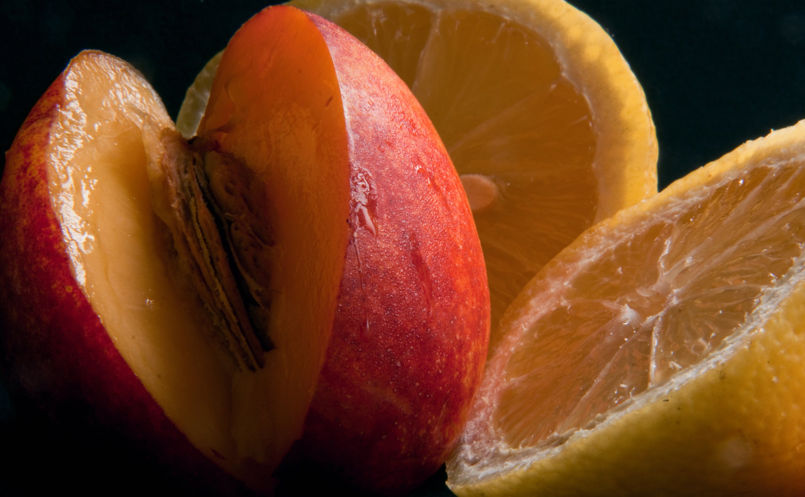 |
| Canon EOS 50D, 190 mm, f/38.0, 15s, ISO 100, 0 EV |
Another still life for this one but this time I decided to give it a different approach. I changed lense as I wanted to take a close up-picture of my nectarines and lemons still life. I placed a black sheet of paper on a stool and another one behind objects until it filled up the frame.
As the available light was very low and I wanted to take the sharpest image possible I used my tripod and camera in mirror lock up mode to reduce vibrations most for this 15 second exposure at f/38.0
I like the natural nectarines droplets and slight hilights. The nectarine is overall slightly more orange than red, at least that's how I see it. I think the balance between Orange and Yellow works well in this case, the black background increases the colour contrasts.
Yellow - Green
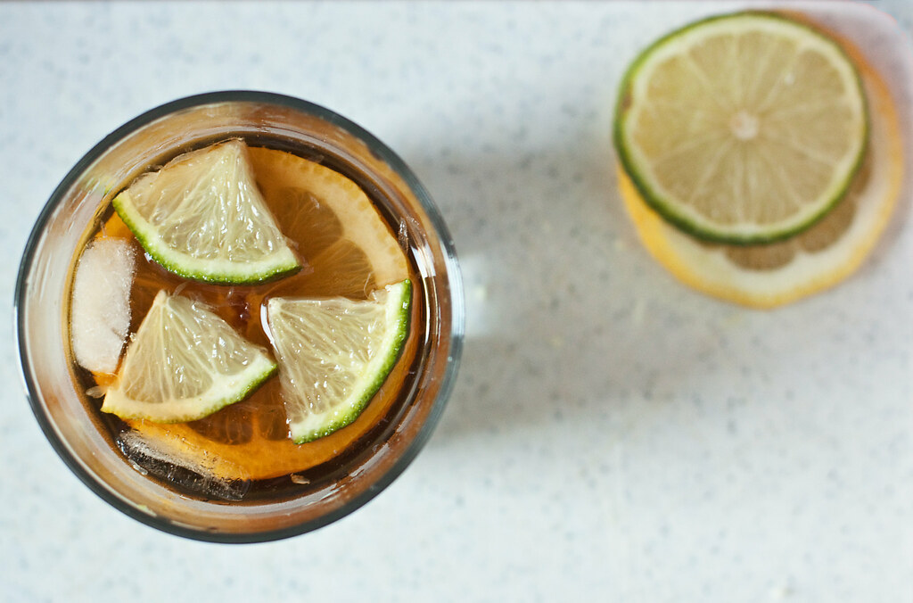 |
| Canon EOS 50D, 50 mm, f/3.5, 1/30s, ISO 400, +1/2 EV |
Another still life here but this time in my kitchen with low light. The goal was to have yellow and green against eachother in a smoother way. Ideally, the green to yellow part should be 3:2. But being fooled by the wrong notion that a lime is mainly green I probably achieved the opposite.
I realise that in many cases our brain tells us something is in such a colour that it fools you in seeing colours objectively.
Colour contrast through contrasting colours
Yellow - Red
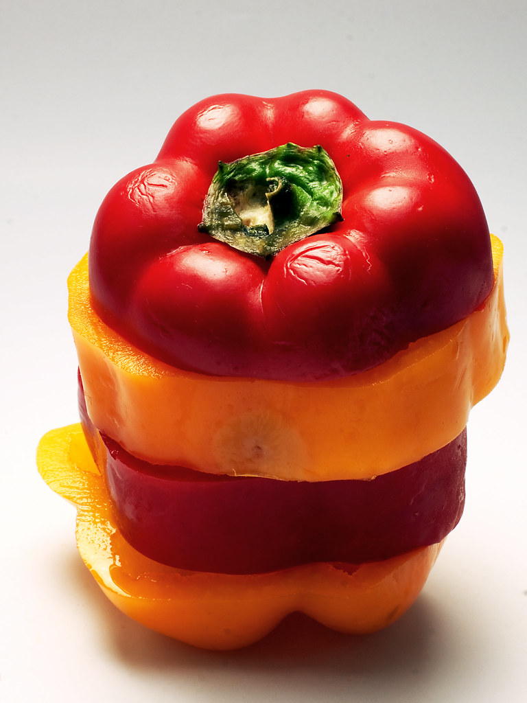 |
| Canon EOS 50D, 50 mm, f/22.0, 1/20s, ISO 100, 0 EV |
The idea here was to contrast Red and Yellow, just placing side by side a yellow and a red pepper did not make it very interesting. Cutting them and mixing them together improved the appeal of the still life. These aren't the most beautiful peppers I've seen but I think the "wrinkles" are interesting.
I feel these colours contrast well against eachother, although it's not always easy to find pure yellow, this one is a bit "orangy".
Purple - Orange
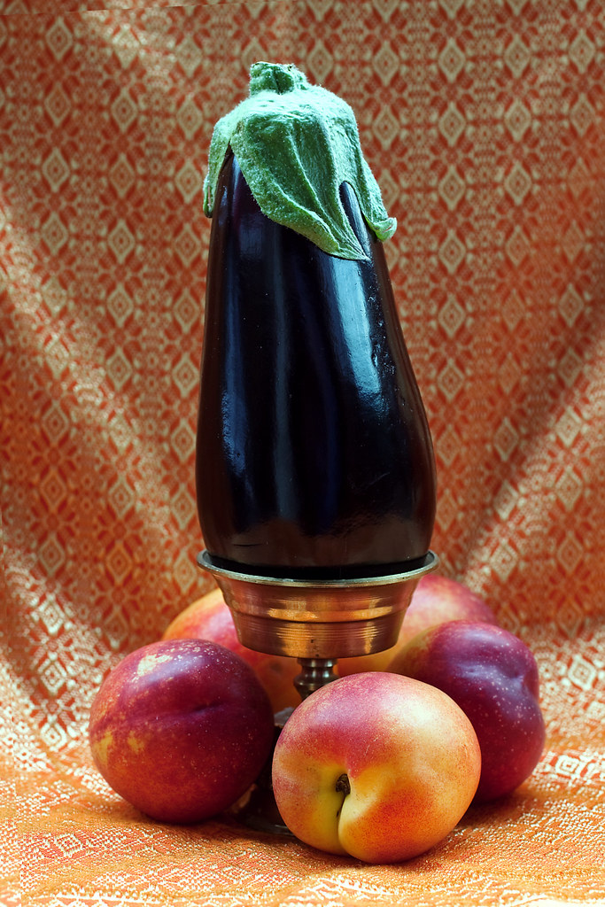 |
Canon EOS 50D, 50 mm, f/5.6, 1/15s, ISO 100, 0 EV
|
Finding something Violet was already a challenge, purple proved to be no different. When I saw this aubergine at the supermarket I thought it would work out being purple. Although it does have purple in it, a very dark one indeed, the reflections of the sun against it made the exposure tricky to balance.
By setting this up on an orange thai silk blanket background and adding nectarines I was able to compare how both colours work out. I must say I do not know what to think about this colour combination, apart from being rather unusual I'm not sure if it's really appealing. I think it could be an eye-catching combination but doesn't really do it justice here.
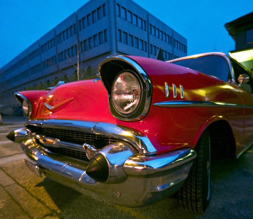
Blue - Red
 |
| Canon EOS 50D, 10 mm, f/3.5, 1/20s, ISO 640, 0 EV |
Out of all the colours I could think of I'd never bet on Blue being one of the hardest to find in natural surroundings. In Switzerland it's actually very rare to have a really blue Sky, it usually is grey or milky, too bright most of times. Water is usually more green or made of mixed washed out colours, blue is probably far away from the most common colours found when looking at water.
Using the blue hour, after sunset, solved the dillema of finding blue for a while. This red car was a good choice to oppose Red and blue in this same image.
Blue - Yellow
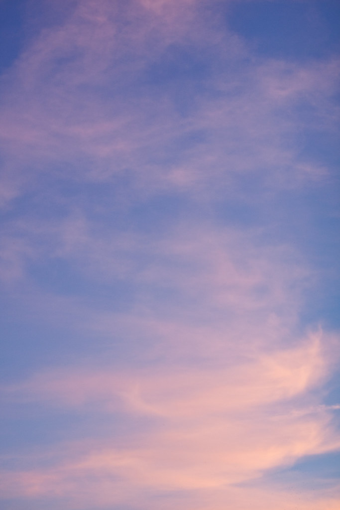 |
| Canon EOS 50D, 50 mm, f/2.0, 1/125s, ISO 100, +1/2 EV |
This was meant to be a simple colour combination but after analysing it this is no longer the case. I can see blue, purple, viloet against orange, yellow, red. Although I would say the main colours are probably Blue, Yellow and red.
This is a capture of the sky at sunset and colours were changing fast. I think that even if they're supposed to be contrasting colour the different blend and shades makes it overall smoother.
colour accent
This is a capture of the sky at sunset and colours were changing fast. I think that even if they're supposed to be contrasting colour the different blend and shades makes it overall smoother.
colour accent
Red
Finding colour accents was just as tricky as finding any subject for this assignment. I really had no idea how to have a colourfull item stand out of a rather colourless background. While listening to LP's the idea came out and I figured it might look interesting using an lp cover interacting with a colour, making it a new image.
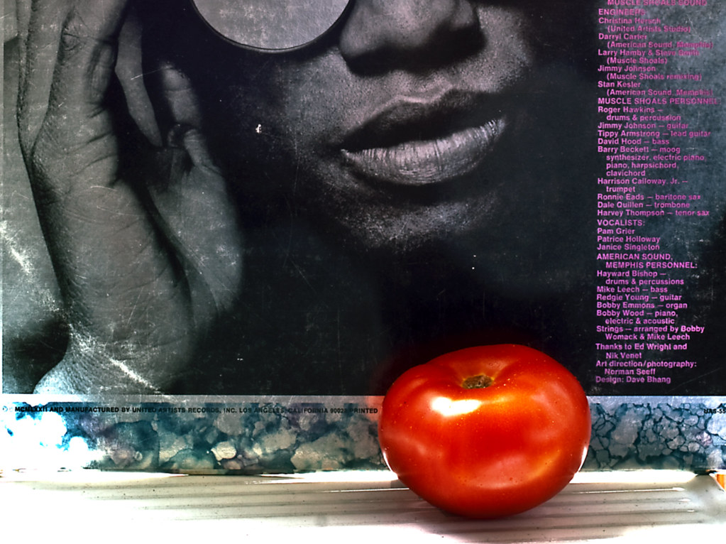 |
| Canon EOS 50D, 50 mm, f/22, 2 s, ISO 100, +1/2 EV |
Finding colour accents was just as tricky as finding any subject for this assignment. I really had no idea how to have a colourfull item stand out of a rather colourless background. While listening to LP's the idea came out and I figured it might look interesting using an lp cover interacting with a colour, making it a new image.
I thought the interaction of the face and the tomato worked well, the tomato really standing out gave it the red colour accent I was looking for.
Orange
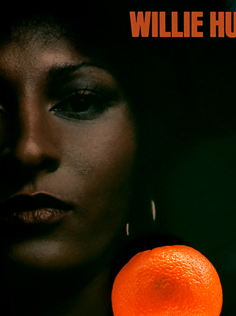 |
| Canon EOS 50D, 50 mm, f/22, 0.5s, ISO 100, -1 EV |
The same approach was used here photographing an orange in front of an LP cover. I'm not sure it works out so well here, the framing and strength of the color accent might be a bit distracting. It is a colour accent after all.
Pink
 |
| Canon EOS 50D, 50 mm, f/22.0, 1.5s, ISO 100, -1 EV |
For this colour accent I decided on a natural colourless background, Rice grains and coffee sounded like a good one. Placing a condom in the middle would do for a colour accent and makes the pink of it really stands out.
One can probably find many symbols in the meaning of this shot but I really did not intend to send a particular message, it's really up to the viewer to find his own explanation.
Although it does look a bit abstract it does attract the eye through the colour accent.
One can probably find many symbols in the meaning of this shot but I really did not intend to send a particular message, it's really up to the viewer to find his own explanation.
Although it does look a bit abstract it does attract the eye through the colour accent.
Blue - Red
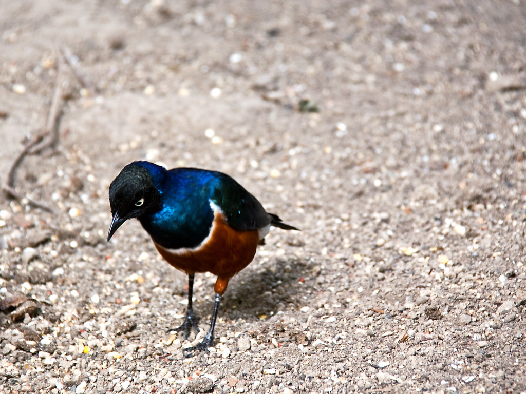 |
| Canon EOS 50D, 200 mm, f/5.6, 1/20s, ISO 100, -2/3 EV |
The colourful bird makes a good colour accent in contrast with the grey-ish background. If I had to take that shot again I would probably use a higher ISO in order to freeze more the fast moving bird, with the available light being quite low. But there was no second chance here and I think I was lucky enough to keep the quality acceptable given the circumstances.