vertical and horizontal frames

This exercise is about comparing the effect of choosing a vertical frame versus a horizontal one. I will comment on what works best to me on each pair.


The vertical frame works best here, having the building tight to the edges of the frame makes it more pleasing to my eyes. The building being more high than large might explain this.


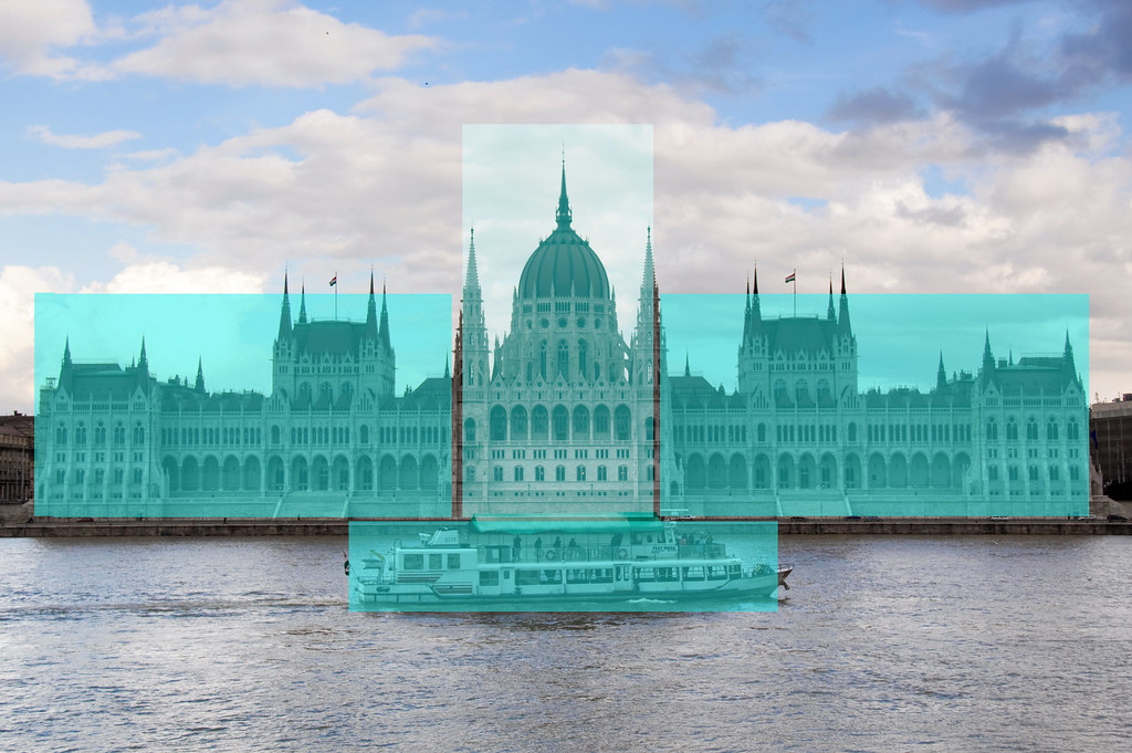
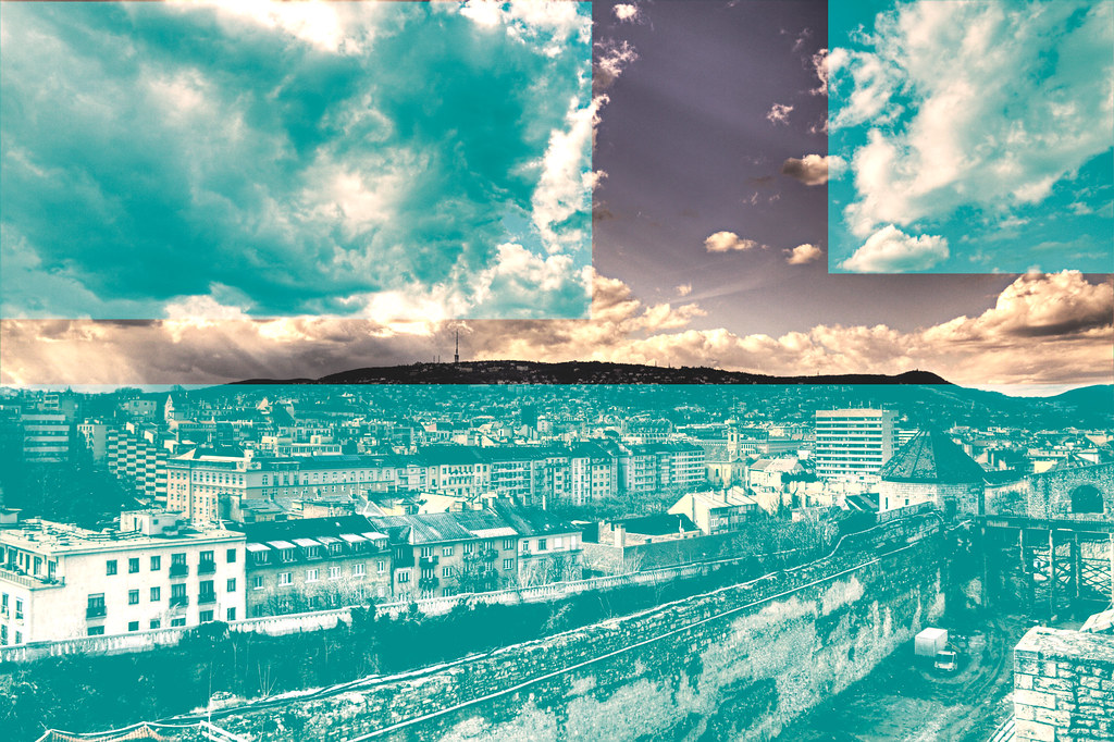
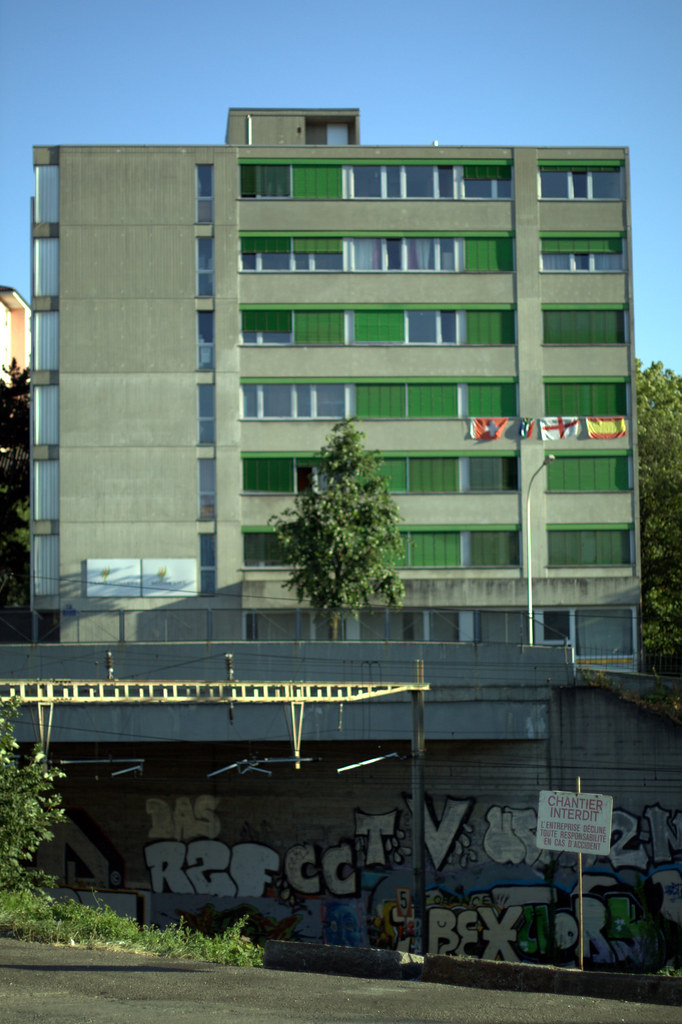
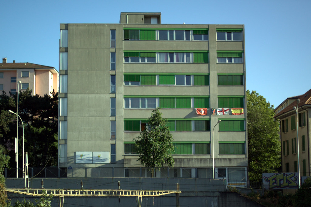
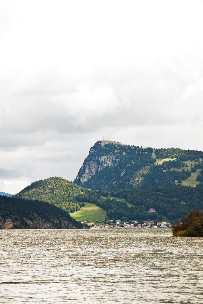
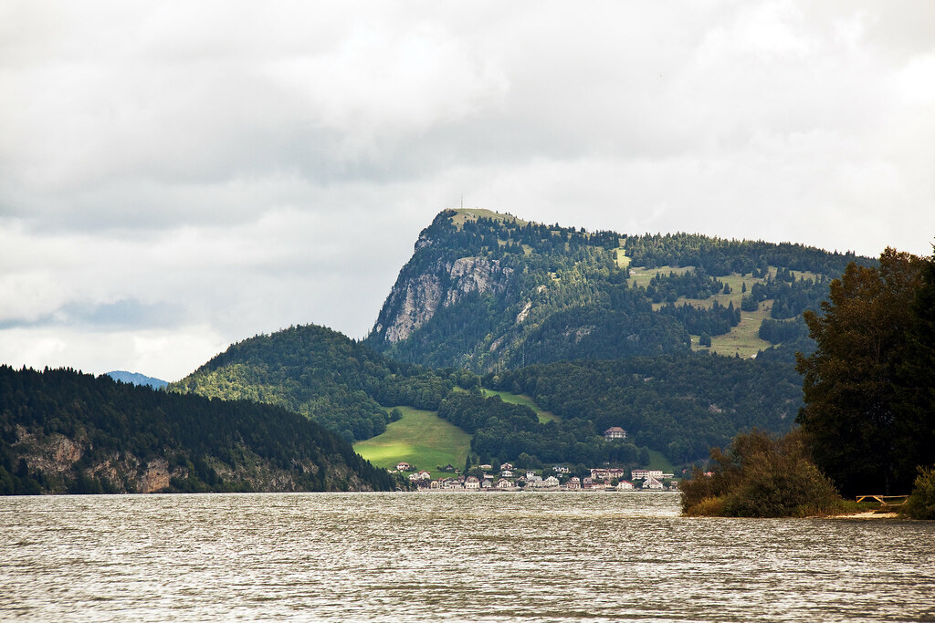
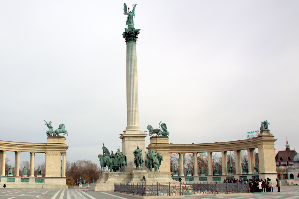
In this case, landscape mode works better. the building being quite large allows it to fill more of the frame. In the vertical frame the sky covers most of the frame but doesn't add anything of interest.


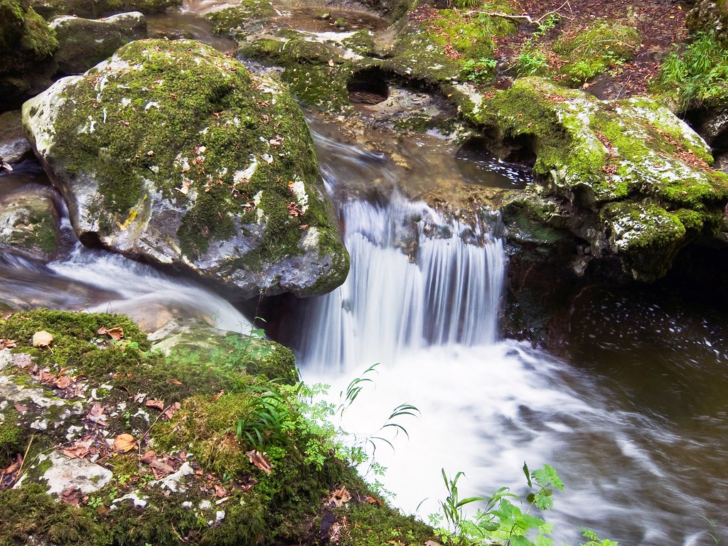
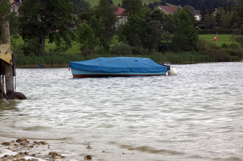
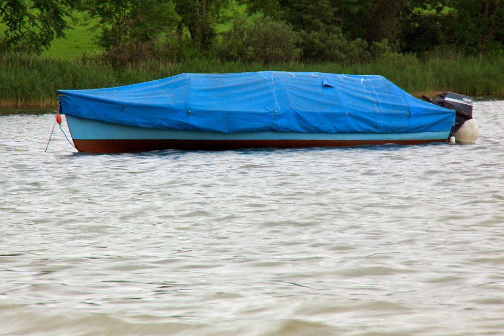
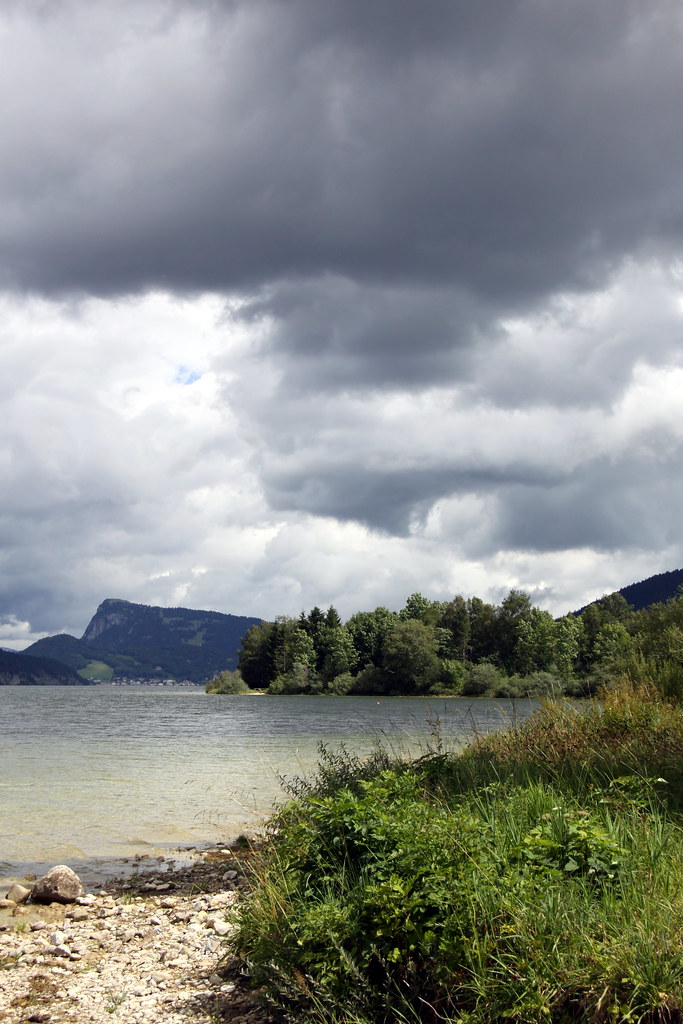
The vertical frame works better in this case. Portrait mode adds more effect to this  unusual scene of trees surrounded by water. I can notice I have naturally positioned the trees at the bottom of the frame.


This one seems to be work best with the vertical frame. What is interesting here is I am not sure if I would have framed it in a vertical frame if it wasn't for this exercise. This shows how shooting in landscape mode is a question of habit.


The subject fills more of the frame in Portrait mode but landscape mode makes the building look much bigger. Having a tree and a lamp post in the frame gives a sense of scale to the building. Interestingly, my first shot was done in landscape mode.


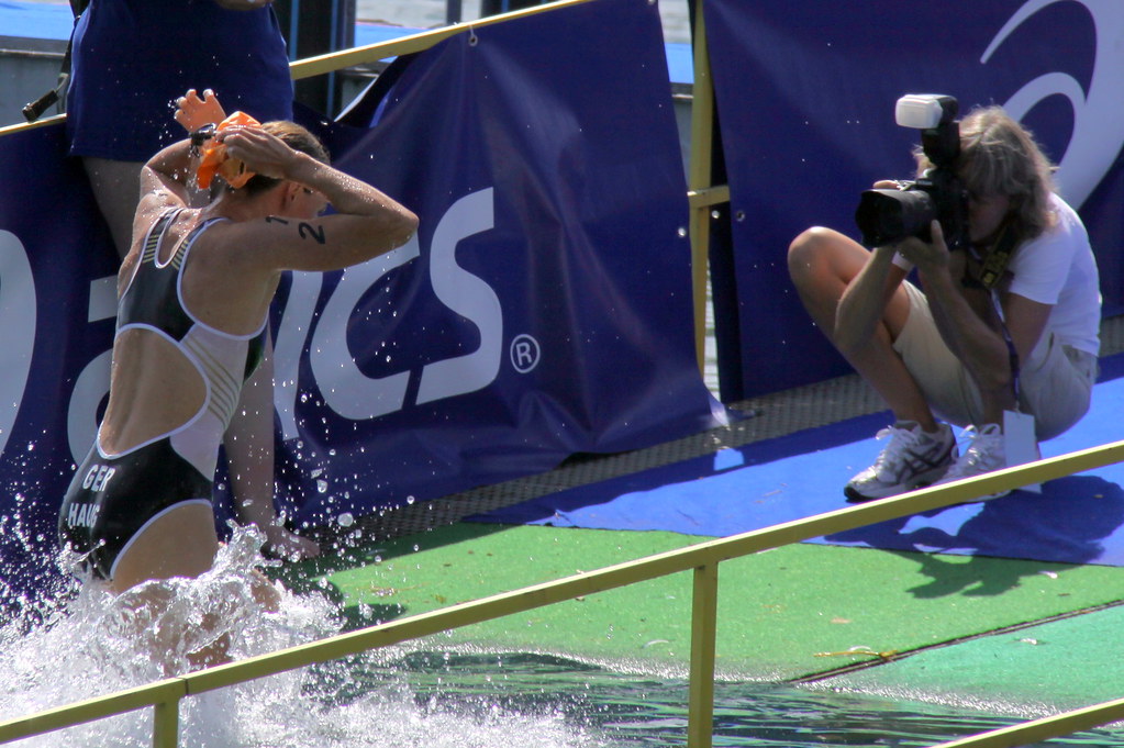
In this candid shot, the horizontal frame makes it more cinematic, probably because it involves people and being used to watch movies on a wide format screen. In the vertical frame I the group is standing at the bottom of the frame, probably to suit my sense of gravity. I'm not sure what I like best out of these two.


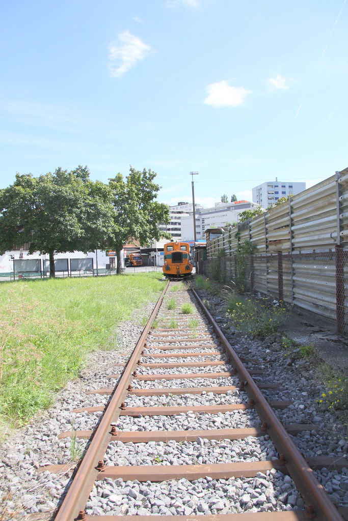
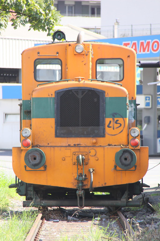
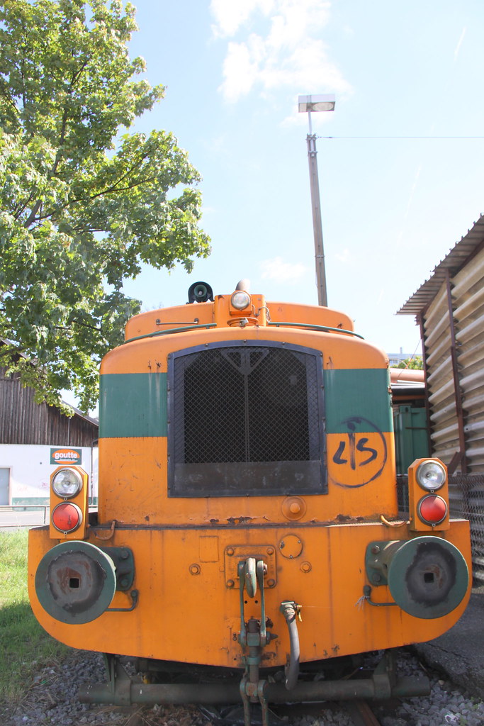
In this vertical shot the electric pole is more isolated from its surrounding. In the horizontal frame, the subject being so tall it forced me to include alot of the surroundings in context. I would have naturally shot this in portrait mode but the horizontal makes it more interesting,


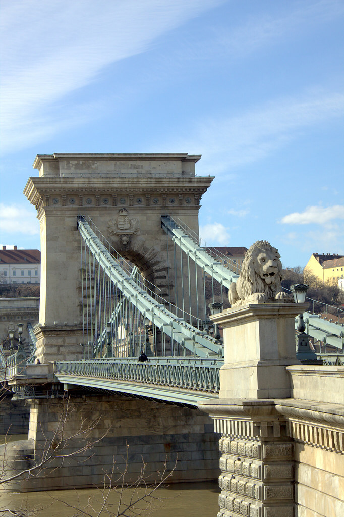
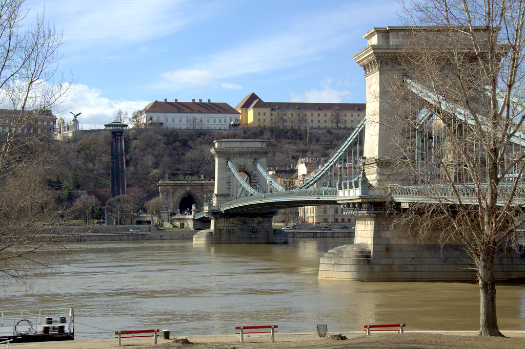
The bridge lost its scale in the horizontal frame. When shooting it vertically it makes it look much smaller. Again, I have put the bridge's support at the bottom of the frame to suit my sense of gravity.


The vertical frame of the door would allow to isoalte it completely from its surroundings, the landscape mode would put it in context.


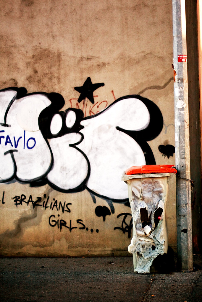
The vertical frame focuses the attention on the burnt bin, the horizontal frame makes the graffiti the center of attention.


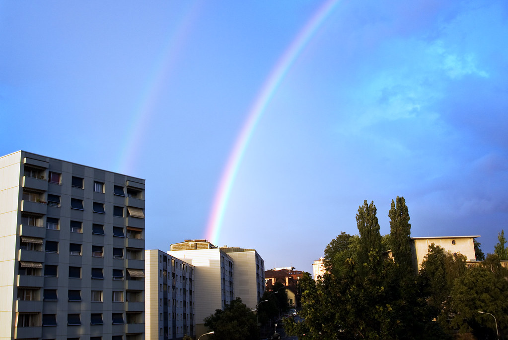
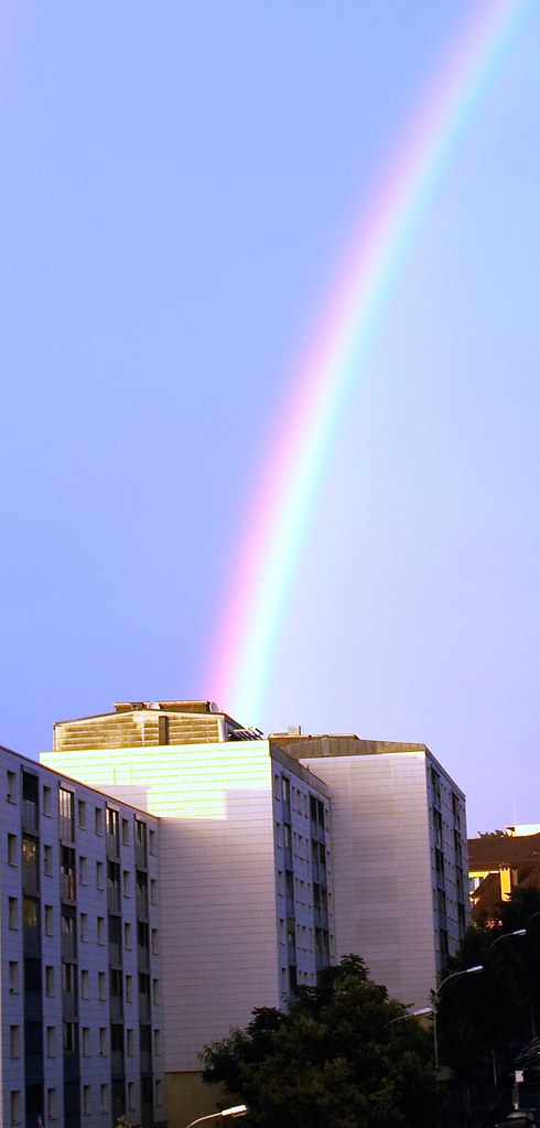
I think the rainbow works out better in the vertical frame, it could be due to the way the scene has been composed with almost a diagonal across the image.


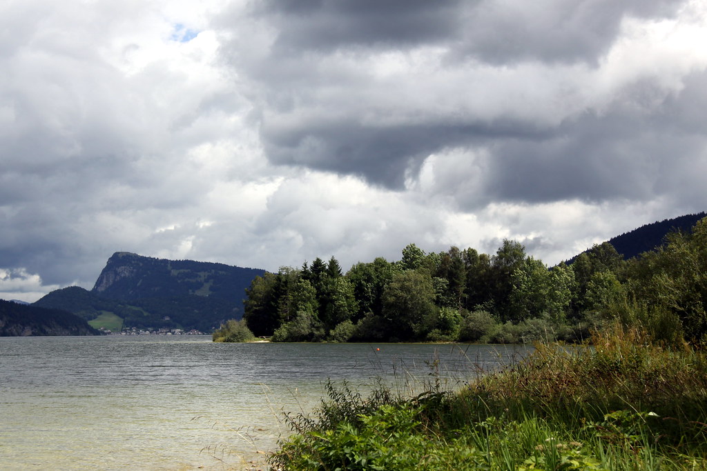
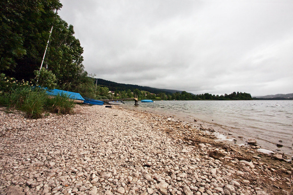
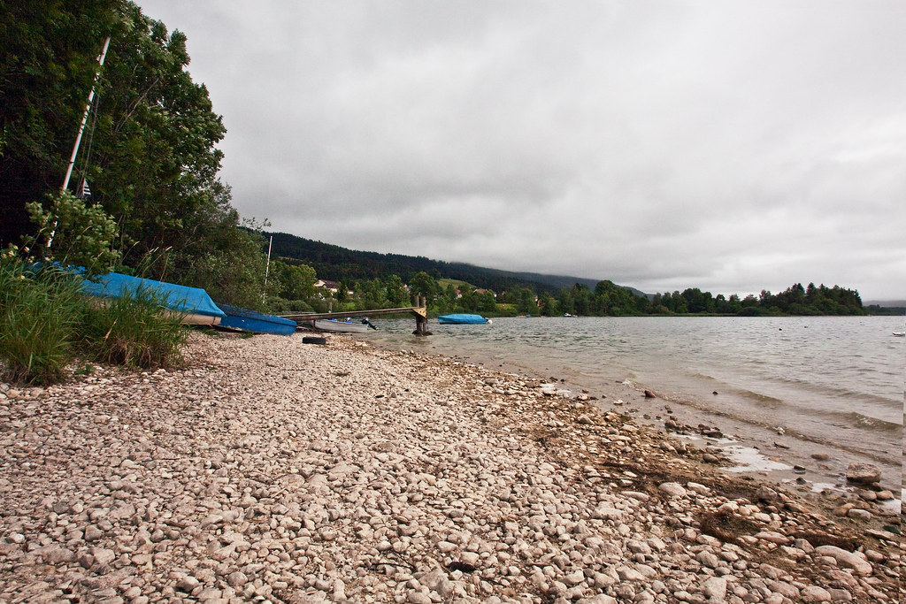
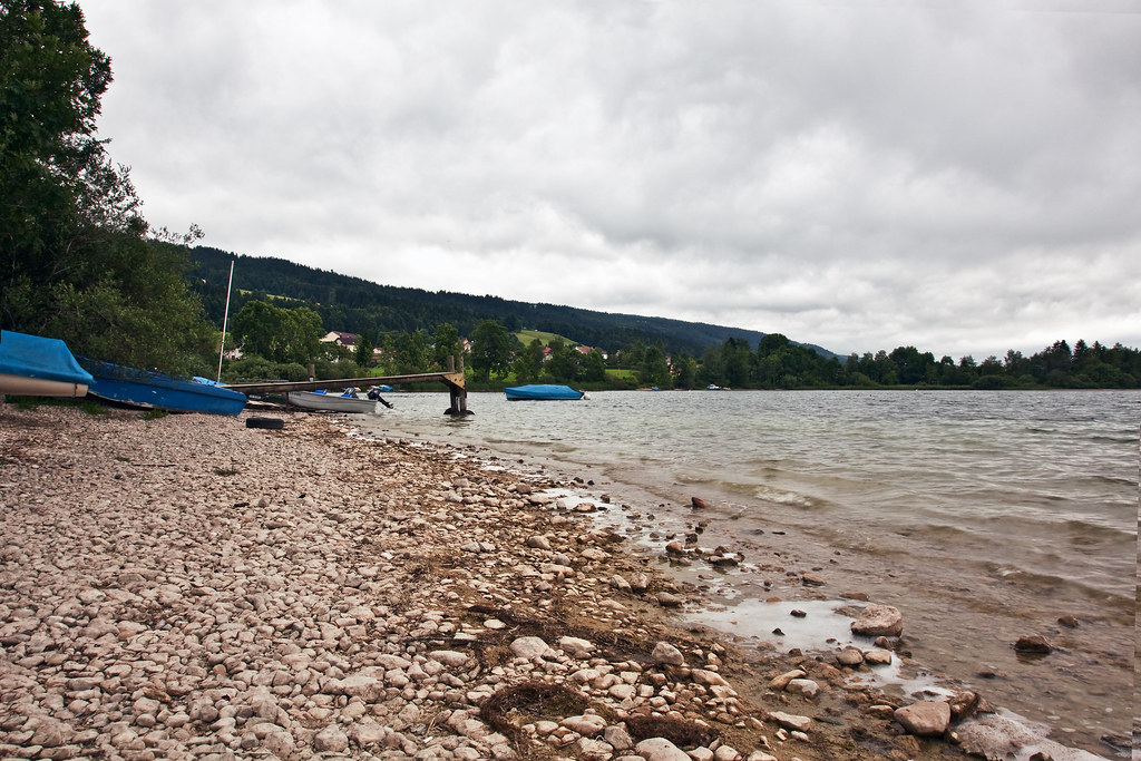
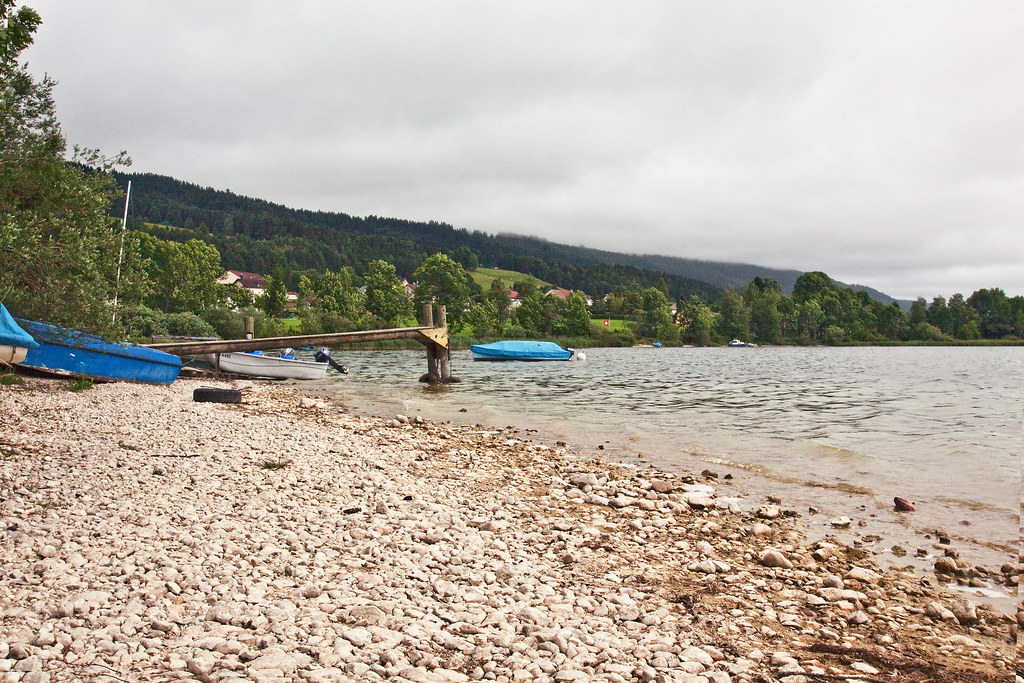
In this landscape, both frames work out well. Being "forced" to shoot it in a vertical frame gave it a fresh look. It looks like a magazine cover format and again it shows shooting horizontally is a matter of habit. I have a preference for the vertical frame.


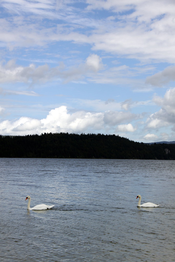
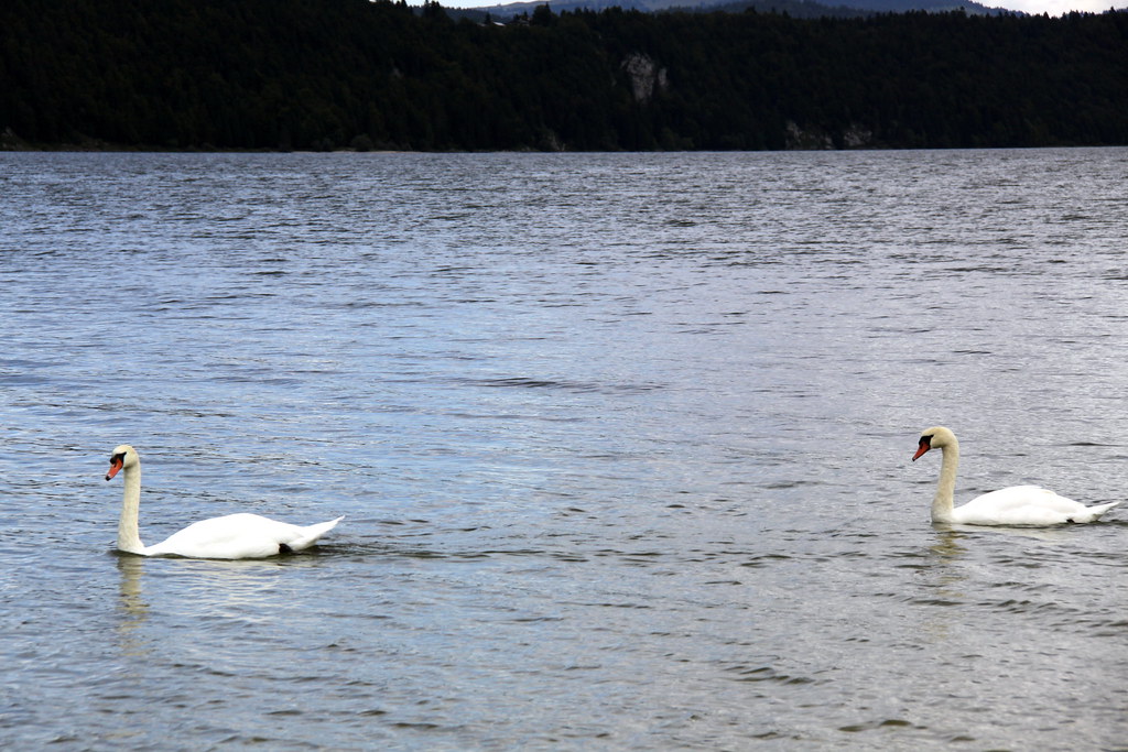
The same can be said here. The horizontal frame is dull but the vertical one includes more of the sky while still making the swans the main subject.


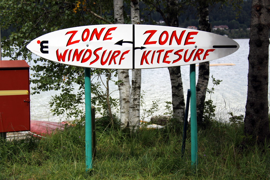
The landscape format works better for me here. it is probably due to the board being more wide than high.


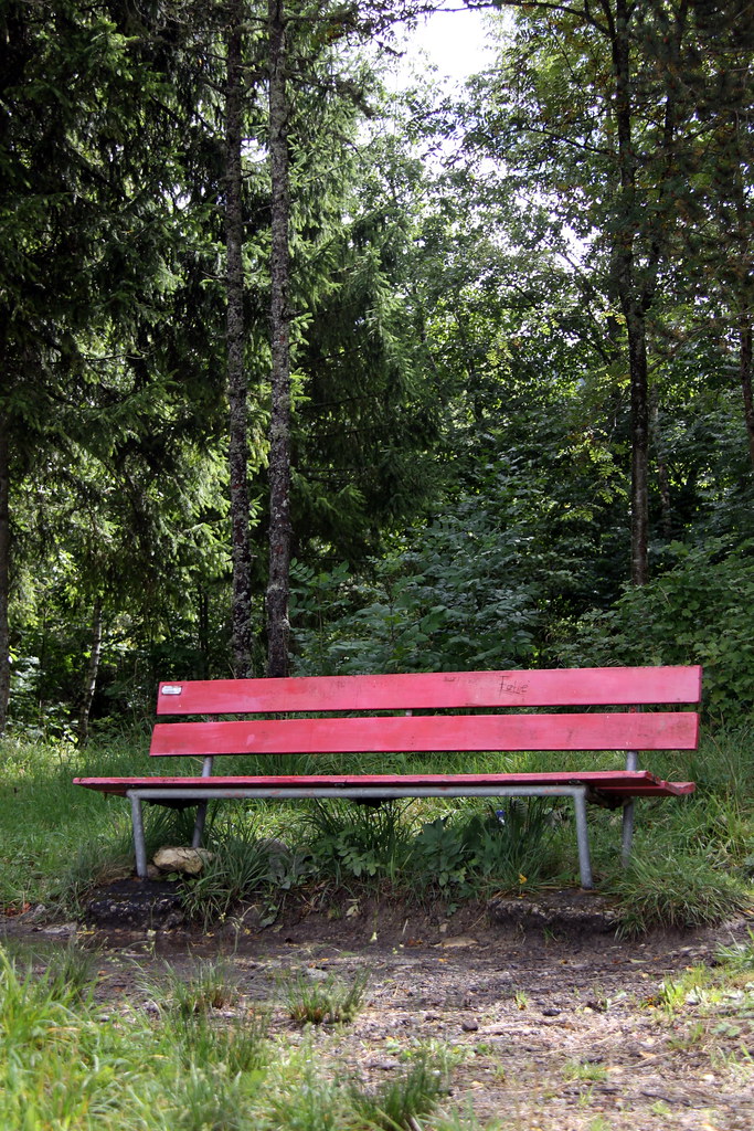
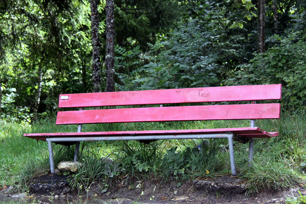
Shooting this bench vertically gives it more appeal, in this case it was a good thing to break the habit of shooting in landscape mode.


I think landscape mode would have worked better if the subject was placed closer to the right end of the frame. But shot as it is, the vertical frame works out better for me. The main subject is has been placed naturally at the bottom of the frame.


The horizontal frame makes it look more like a postcard and the vertical one as a magazine cover. I like the vertical frame more as it is more uncommon.


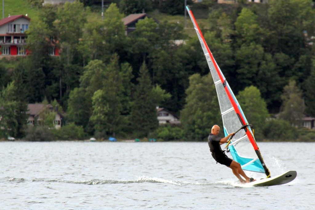
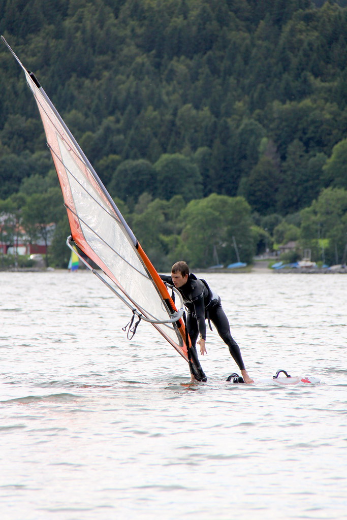
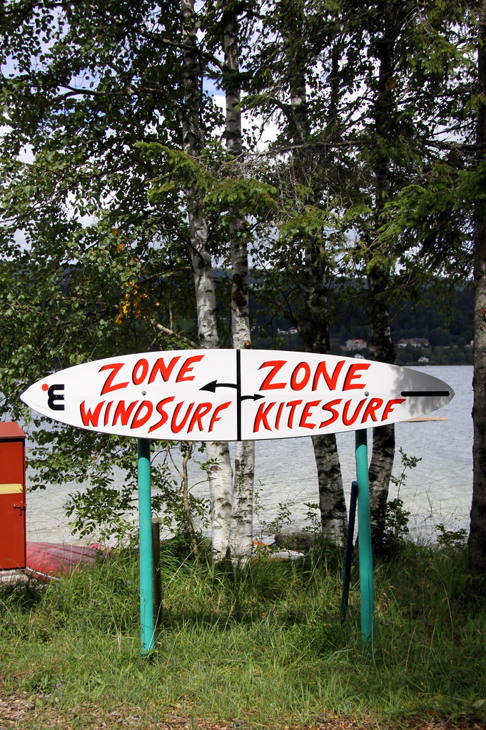
I think both vertical and horizontal frame could work well with windsurfing depending on the action. Lanscape mode includes more of the background and the vertical frame focuses on the windsurfer and sail.


In vertical mode, the structure of the bridge has been placed at the bottom of the frame. This is another habit that goes with shooting vertically in my case.


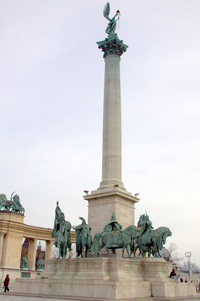
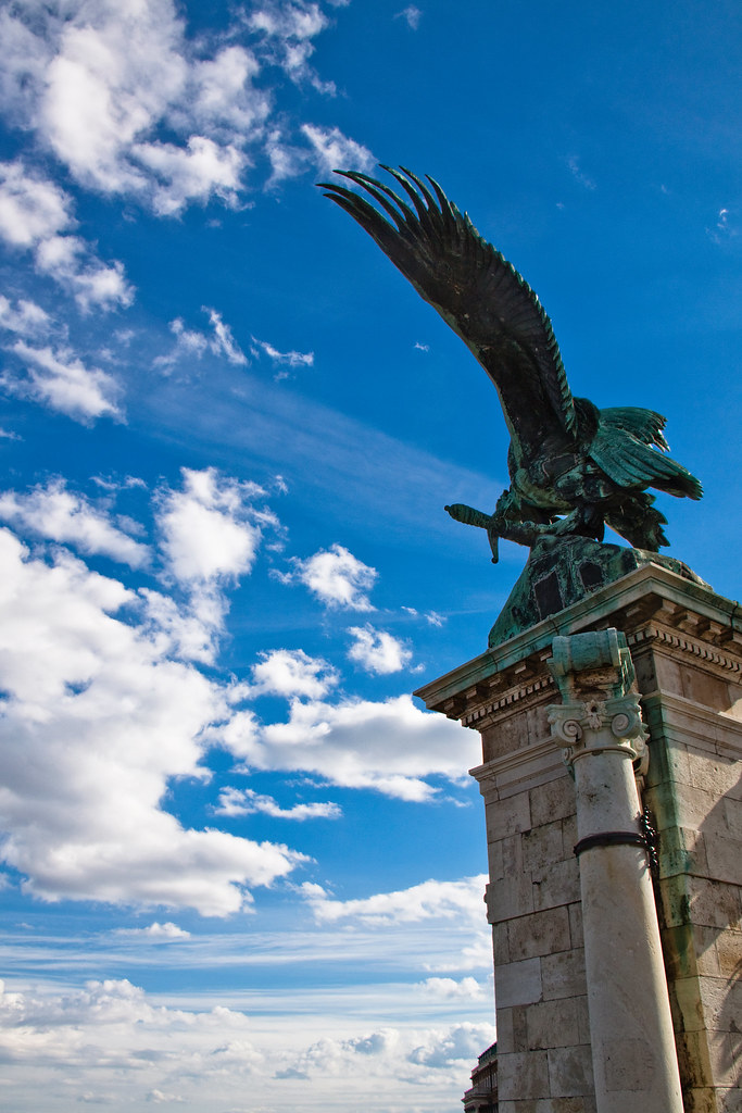
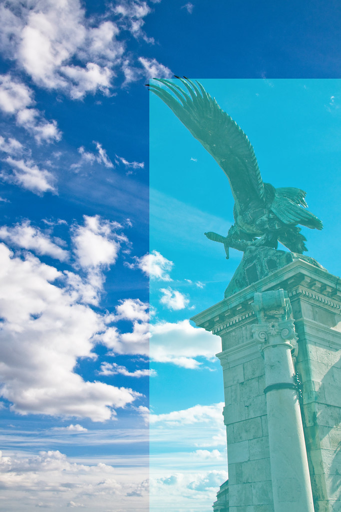
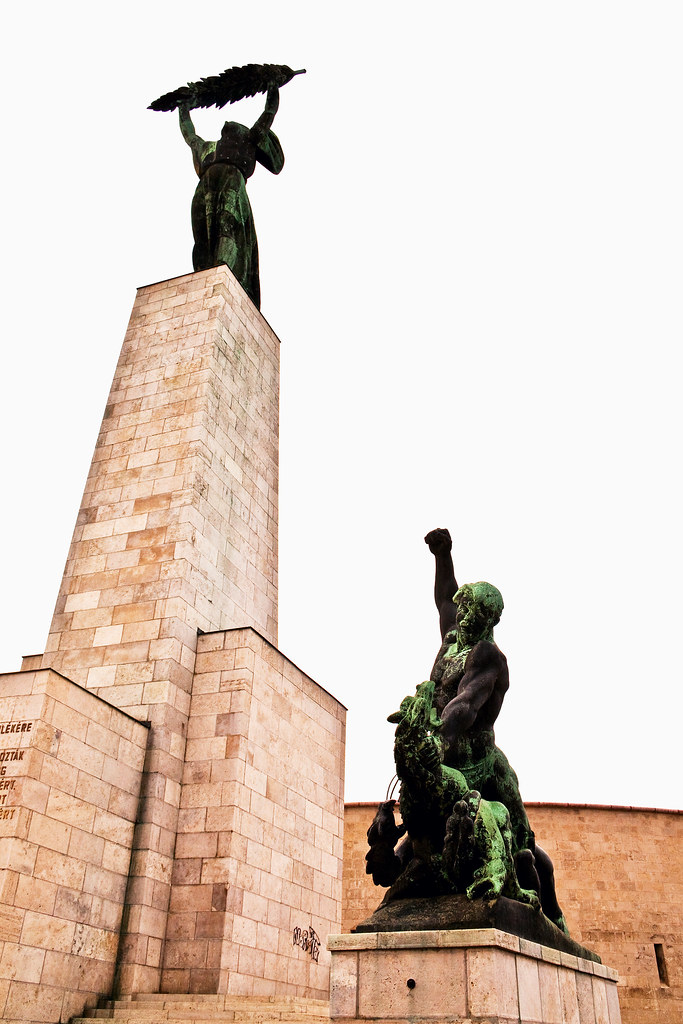
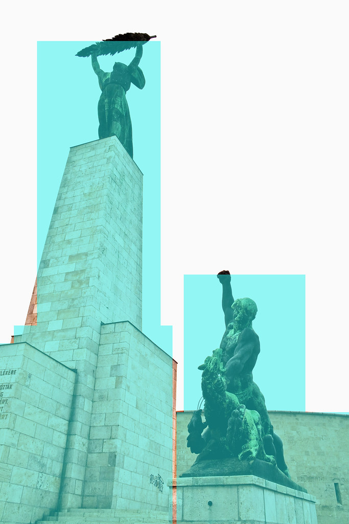
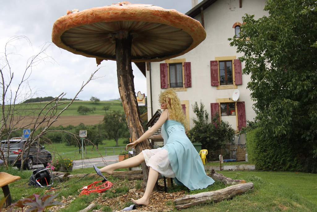
The horizontal frame gives a sense of scale to the statue. While the statue would fill more naturally a vertical frame it works out best in landscape mode.


Exercise: Balance

The concept of balance is fairly easy to understand in theory, especially when analysed with a weighing scale or simple geometric shapes. Analysing balance in my own photographs is really a challenge to me. 

My approach at this exercise will be to note down at first glance whether or not the image is balanced or not.
Then, through analysing the image more deeply I'll compare my initial perception with my second judgement.


1st glance:


The image looks balanced to me. Although something is bothering me, I feel like rotating it anti-clockwise for some reason.

After analysis: The stone carries more weight but the water takes more space, it's still hard to say whether the weighing scale would fall to the right or if it's balanced after all. However, I see it as balanced.


1st glance:
Again, I feel it's blanced to my eye. The clowds to the left and the statue to the right carry the same weight.
After analysis: I assume the sky does carry some weight. I think it is an important element of the picture. the clouds add something and I feel it's balanced with the statue of the bird. I feel there is some movement that start at the bottom right of the frame and extends to the left through the wings and then with the clouds moving towards the left.


1st glance:
It looks balanced. Although it's not perfectly symmetrical and the boat is not completely straight I'd say it's balanced.


After Analysis: I think each side of the building carry the same weight in the picture. The weight of the boat being in the center but slightly bending to the left and slightly off center to the right keeps the balance ok. I'd say the picture is balance through it's opposite unbalanced areas. 


1st glance: The picture is not balanced. I feel there is tension in this image but that doesn't make it balanced
After analysis:The weight of the higher statue is bigger than the other one, the blown out sky doesn't weigh anything. However, it is hard to judge as the statue on the left is leaning to the right. I feel there is more tension than balance but it makes the image interesting to me.


1st glance:
It looks balanced to me.


After analysis:
The athlete being bigger but closer to the center of the frame with the photographer being closer to the right edge of the frame I would say they outweigh themselves. I'm not totally sure that would be the way to see it but I don't see other elements in the picture that would weigh anything. It still looks balanced to me.


1st glance: not really sure if it's balanced or not but it doesn't bother me much in this picture.


After analysis: It's not easy evaluating the weight of the clouds against the blue sky.
If they had an equal weight then the picture would be balanced, if not there is more weight on the left side of the scale as shown on the diagram.


If the pictures chosen were minimalist it would sure be easier to analyse the balance of it. Having many elements that weigh out subjectively doesn't make the concept of balance easy to understand. I hope with time it will be more obvious to me.

Exercise: Focal lengths and different viewpoints

For this exercise I decided to use my 18-200 Canon lens. I believe it's the ideal lens for this purpose as it goes as wide as 18mm and zooms at 200 mm.

I chose an abandoneed train as the subject and framed it vertically.I zoomed at 200 mm and backed up untill it was close to the edge of the frame.

This is the view I have when taking a picture at a focal length of 18mm.


This is in the same position but at a focal length of 200 mm.


I started walking in a straight line looking through the viewfinder at a focal length of 18mm. It surprised me how close I had to get to the object to fill in the frame. I was only a few inches away when I took this next shot.


It took around 47 foot steps to get to this point. The difference in perspective is amazing. Now I realise how different it is to shoot a same object from the perspective of a wide angle or a telephoto. In this situation the wide angle makes the train appear much bigger and gives depth to the image. In the telephoto version the image is compressed and looks very flat. it's hard to tell how far are the background elements as opposed to the wide angle.


Exercise: Focal lenghts with variable focal lenghts (with zoom or interchangeable lenghts)

wide angle lens 10 mm


Wide angle 13 mm


wide angle 16 mm


wide angle 24 mm


telephoto 100 mm


telephoto 200 mm


I think the result of this exercise is quite obvious, choosing the focal length comes with how close you want to get the subject in the frame.