Exercise 1: Horizontal and vertical lines

Vertical Lines


Many monuments use vertical lines,The higher it is the greater the sense of being dominant is increased


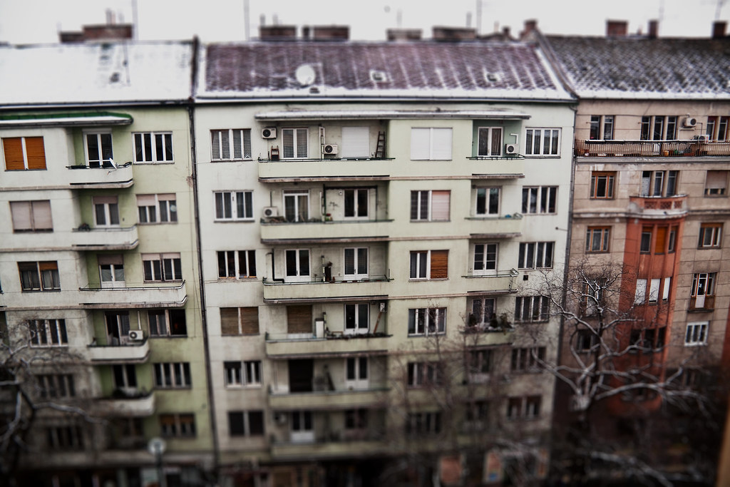
Buildings use many vertical lines, especially skyscrapers


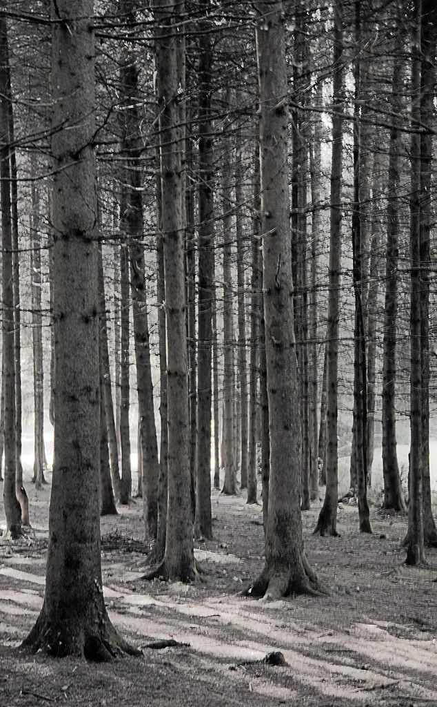
Trees are natural verticals

Lamp posts can be compared to trees, but as man made verticals


Vertical Lines aim to the sky, and can be seen as overpowering. I believe it could be seen as superior, more powerful, intimidating or even spiritual. Verticals are often aiming beyond the reach of human beings, I think this can be used effectively in how an image can be perceived.


Horizontal lines

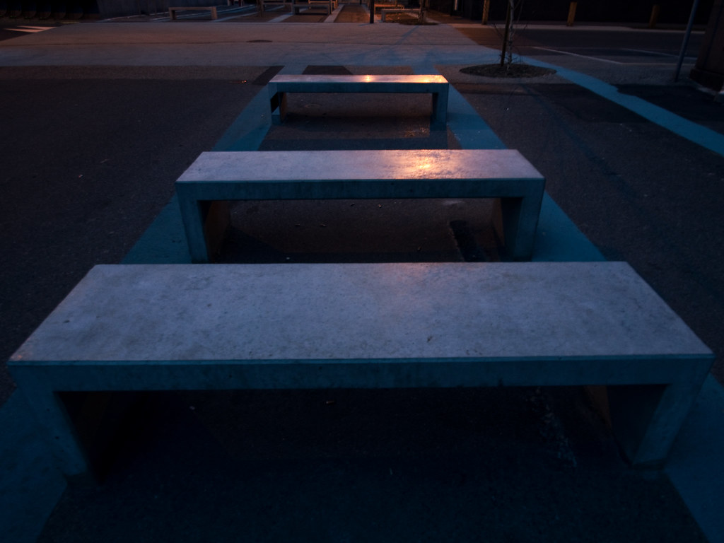
These Row of benches present horizontal lines

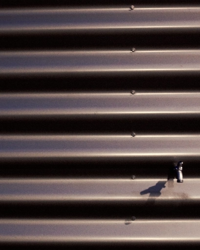
This industrial metallic wall uses horizontal lines, probably due to massive manufacturing of the material


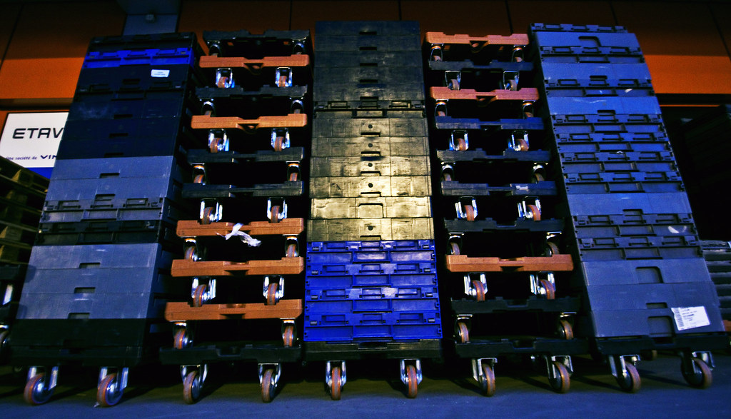
Although vertical lines can be seen here, the perspective makes the horizontal lines more dominant and  provide stability.


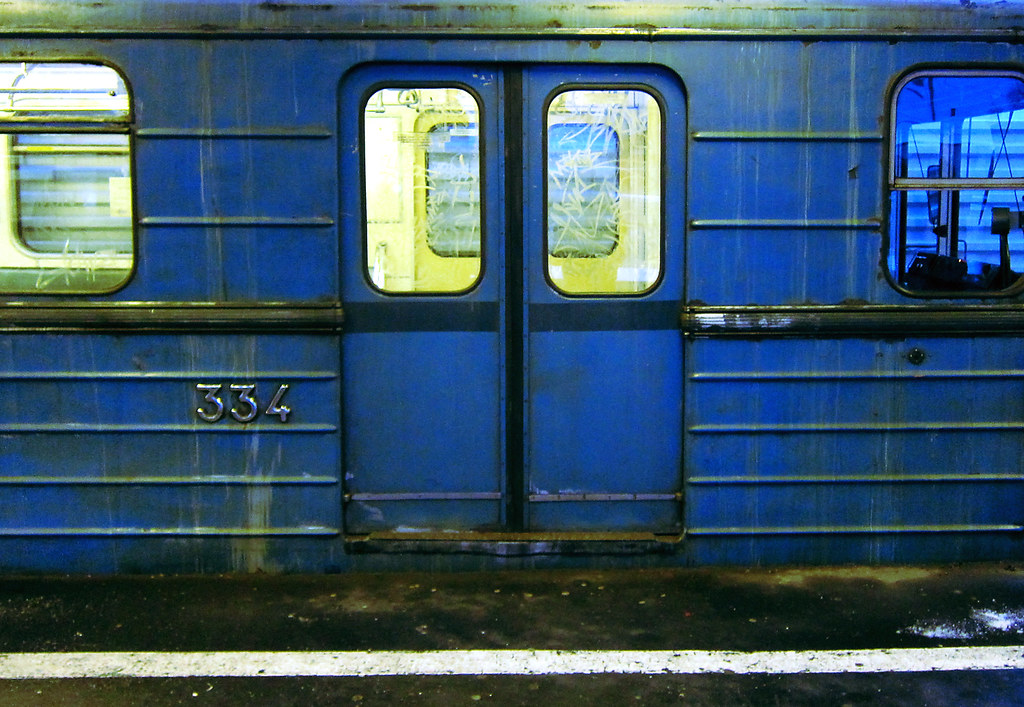
The horizontal lines of this metro gives continuity and one can imagine the extensions on both sides of the frame.


How does Horizontal lines work for design?
I think the key element is the fact that horizontal lines  show stability in relation to gravity, filling the condition that it graphically parallels the ground as much as possible. It will most certainly create less tension than with other lines. Being used to seeing horizontal frames in advertisement, TV or the camera's viewfinder I believe we feel more at peace with horizontal lines. Could this make the picture a bit dull or boring?


Multiple points set


This is the whole set picture by picture from the slideshow


This picture above is my final composition. Although it may be very abstract what is pleasing to one or another I can see the benefits of moving the objects around.


Exercise 3: Multiple points

6 photographs.

In this exercise the aim is to create a composition of a still life made with 10 objects, with a sequence of photographs of the placed objects, 1 by one.

I have decided to use a plain background, even though an uneven background was suggested in the exercise.

I have placed one by one dried nuts and fruits on a white cardboard box.
A tripod, flash and 50mm lense were used.

All pictures have been processed the same way through an automatic photoshop script, automating an action
I had created processing the first image.
I adjusted white balance, exposure, contrast In Adobe Raw. The file was then sent to photoshop and the white background has been repainted white as the original one wasn't usable.


You can view the set through the following slideshow or view the picture set via the link below it.


This exercise was vey helpful in realising how difficult it is when you have the freedom of being totally in control. A still life composition such as this one carry so many tweakable variables it can become overhelming.
This one being my first, I had a hard time choosing the background and something I could light up easily. Having no lighting system I relied on my flash and post processing on Photoshop, I used a white cardboard as the background which had nasty reflections caused by the flash. 

When it comes to the positions of the elements it could take forever to find the correct match as the possibilities are almost endless. However, What I've found out is the composition is usually more appealing with odd numbers of elements. Although, from 5 elements and up the eye tends not to count the number of elements anymore but somehow, it seems to be pleased by odd numbers.

Placing the elements is key. I honestly thought just throwing 10 nuts  like a handfull of dices on a white background wouldn't look dramatically different from a carefully planned composition. While this could sometimes work it's much more efficient making your own decisions and trying out different scenarios.
In this simple exercise it was easy to see the way the elements were displayed could radically change the whole dynamic of the image.

Exercise 2: The Relationship between points

For this exercise I will use 2 similar objects in order to focus on the relationship between the points.


It's hard to say in this one which attracts more attention than the other. The eye is drawn from one to the other  but we assume they are both going towards the top right corner of the frame, giving a sense of direction.


I believe the position of the red coaster  attracts more attention as it is closer to the center.


The position of the two elements, similar to human eyes, makes them attract attention equally