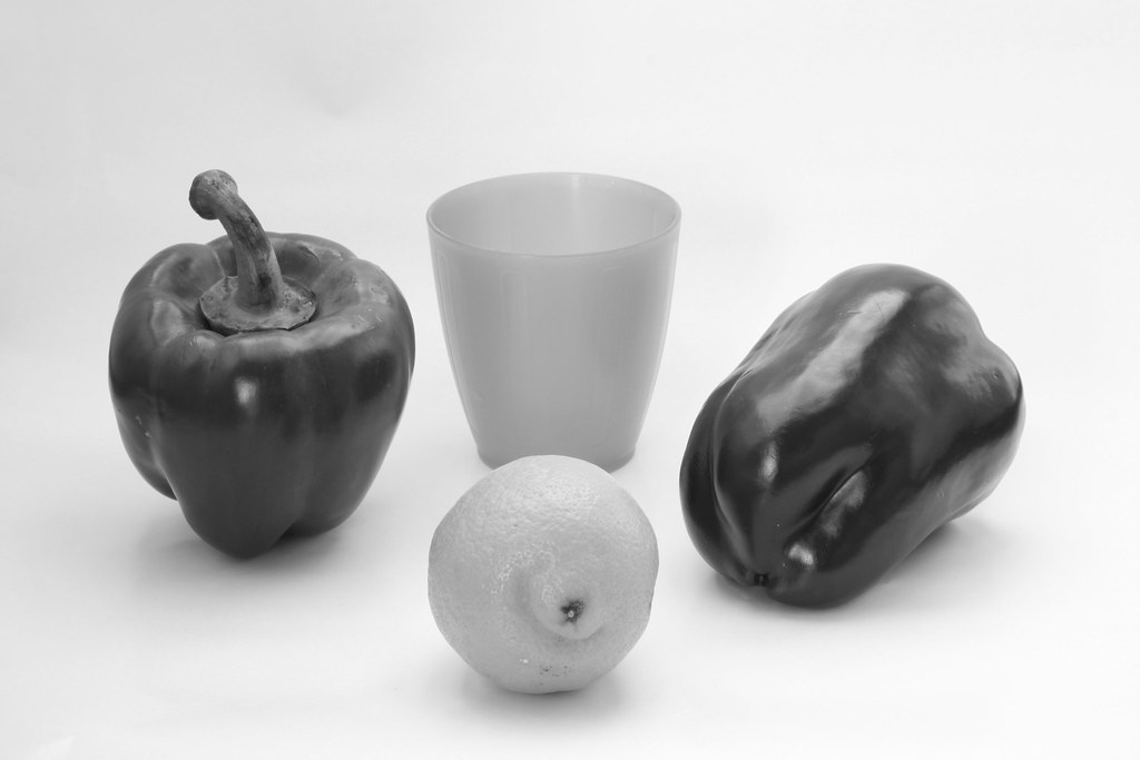
For this Exercise I've built a DIY lightbox (more info here). I've placed a green and a red pepper, a lemon and a blue plastic glass against a white background. Before arranging the still life I took a shot of the white background and set it to my custom in-camera white balance.
I've used natural daylight, set up my tripod and in aperture priority mode with a f/16 aperture. I've also used a remote release to minimise any camera movement.
Here's the setup:
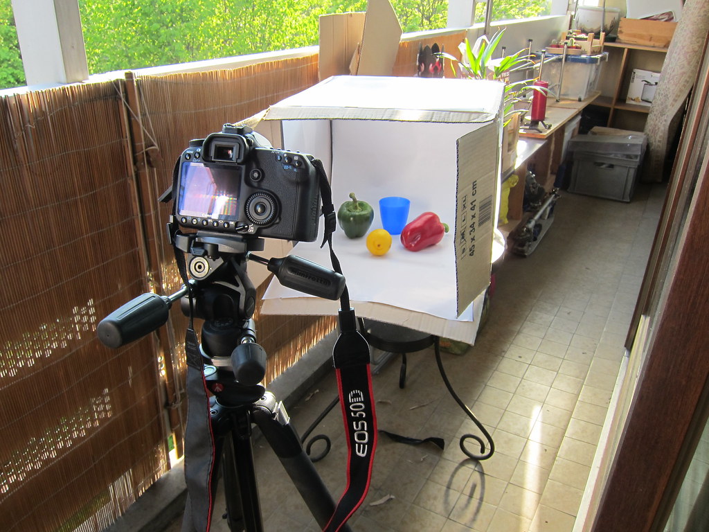
Here's the setup:
Original shot:
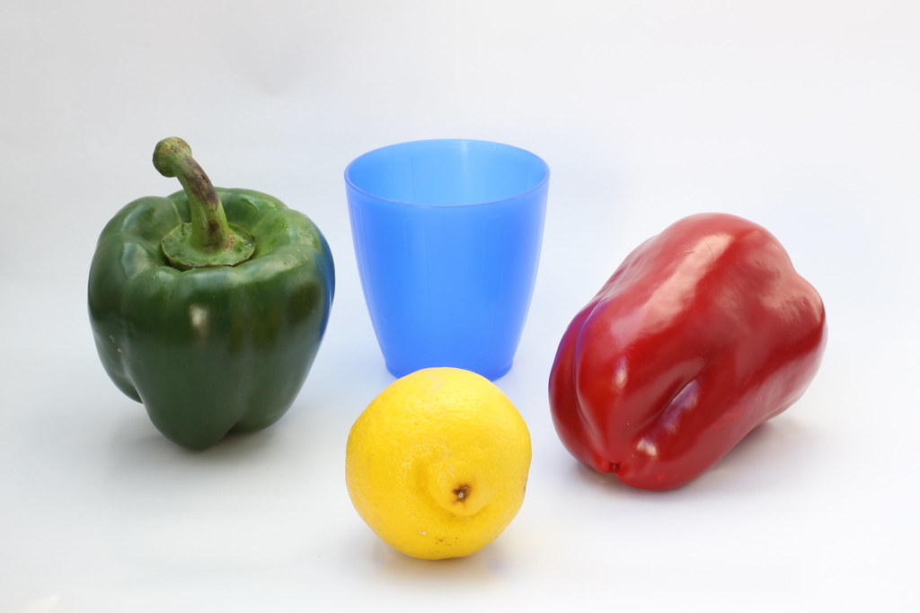
50mm, f/16, 0.25s, +1 ev, ISO 100
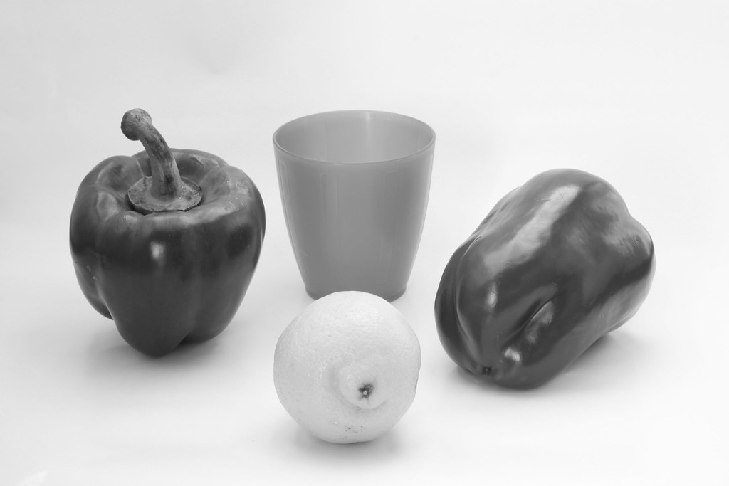
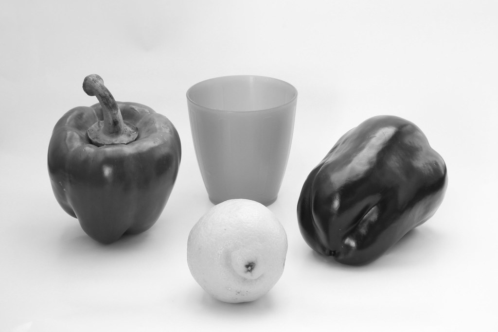
I then used Picnik to process the file as Photoshop wasn't available to me. I've simply used the black and white filter for this next shot.
Black and white, no filter:
Black and white, yellow filter (I eye picked in picnik a yellow that seemed yellow to my eye):

Although the effect is not so obvious, the yellow lemon appears lighter and the whole image too.
Now, I'll try with the red filter:
Black and white, red filter:
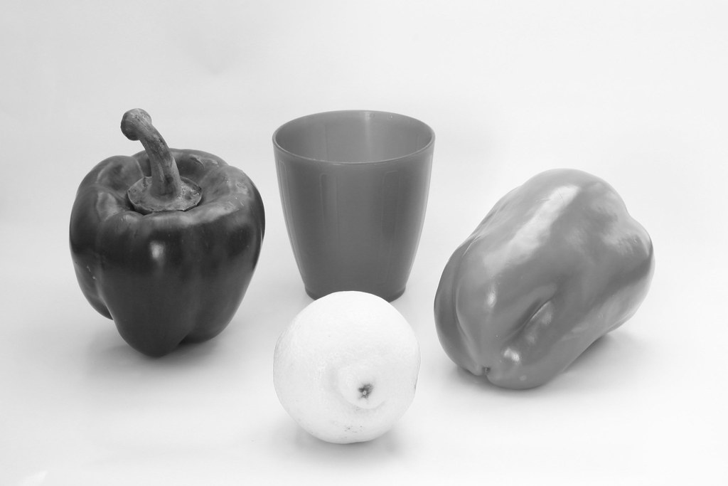
I'm surprised at the result here, although the red pepper appearing lighter was expected I don't really understand why the lemon appears a lot lighter than with the yellow filter.
Black and white, Blue filter:
Blue appears lighter as expected, other colours appear darker, making the lemon almost in the same tone as the blue glass and both peppers look as if they were ion the same tone too.
Black and white, green filter:
The green pepper does look a bit lighter here but the effect is more noticeable on the red pepper appearing darker and the lemon appearing lighter but with more contrast.
I believe the choice of the original colours influences the effect of the filters. It would also be interesting finding out how using the photoshop filters could make a difference.
No comments:
Post a Comment