Combination of primary and secondary colours
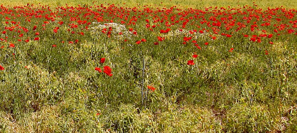
1) Red / Green = 1:1
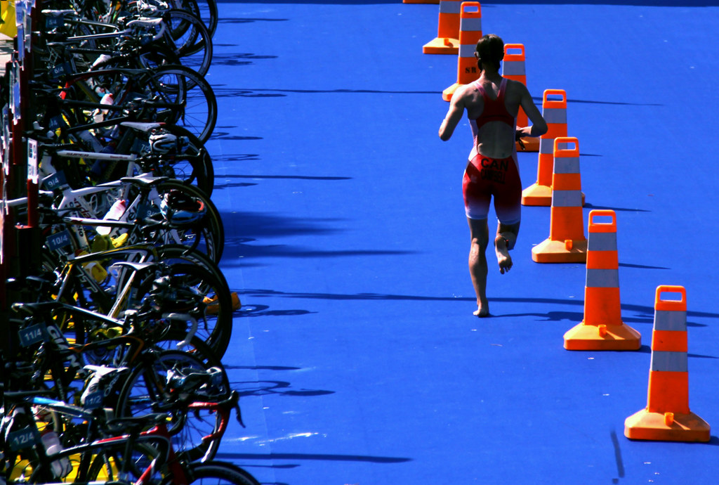
2) Orange / Blue = 1:2
3) Yellow / Violet = 1:3

3 photos of combination I choose appealing
I realised quickly that most of my pictures have never really been colour oriented so I looked into the few ones that did contain colours as part of the interest.


I realised quickly that most of my pictures have never really been colour oriented so I looked into the few ones that did contain colours as part of the interest.
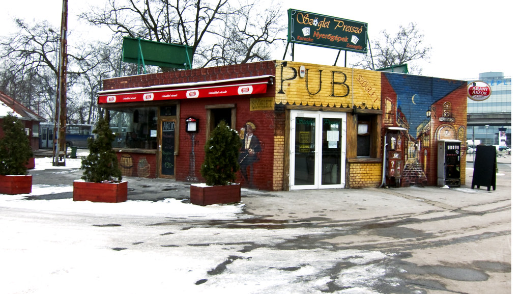
This Picture is more difficult to analyse. Many colours come to mind: Yellow, Blue, Red, green and shades of all of them. They all stand out against the grey, white snow around. It's appealing in some way and at the same time a bit disturbing. Overall, I think it makes it interesting
This Street scene would certainly not look appealing at all without the contrast between Blue and Orange. Giving a bit of life to this otherwise very grey scenery.
Although I agree one can argue it isn't the most appealing scene Colour does help to improve it, the red light and the blue trash add something to the picture despite it's unattractiveness.
No comments:
Post a Comment